Archive for the ‘calligraphy’ Category

Hand-Lettering with Pencils & Upcoming Workshops!

0 Comments

Hey friends!! Welcome here. I’ve got 3 upcoming workshops this summer (more in the works, fingers crossed). I hope to see you there! 

Beginning Brush Lettering Workshop | DRAPER, UT | JULY 19

Learn brush lettering based on more traditional foundations and how to manipulate those foundations to write some funky letters! All skill levels welcome, but it is geared more toward beginners. Lefties welcome!

Eventbrite - July 19 Brush Lettering Calligraphy Workshop

Penmanship Workshop | PROVO, UT | AUGUST 16

Learn the art of beautiful penmanship and how to harness your own style to tell your story. This is perfect for beginners, lefties and future brides! We’ll go through foundations, style and how to address an envelope. 

Eventbrite - Beginning Cursive Penmanship & Letter Writing Night

2-Day Brush Lettering/Digitization Intensive | NASHVILLE, TN | AUG 25-26

Join me in Nashville for a whole lot of fun with a 2-day lettering intensive with the pointed brush. We’ll dig deeper than in any other class in the two days. We’ll go letter-by-letter through variant options, work on word and compositional structure and style structure. At the end of the class, we’ll work on the beginning essentials of digitization by making our own personalized stamps with our artwork. All skill levels welcome. 

Paperinkarts - brush lettering event august 2018

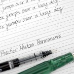
I hope I can see you at one of the above workshops this summer. We always have a blast and I try to pack as much information as possible so you leave the workshop motivated, empowered and ready to continue your calligraphy journey.

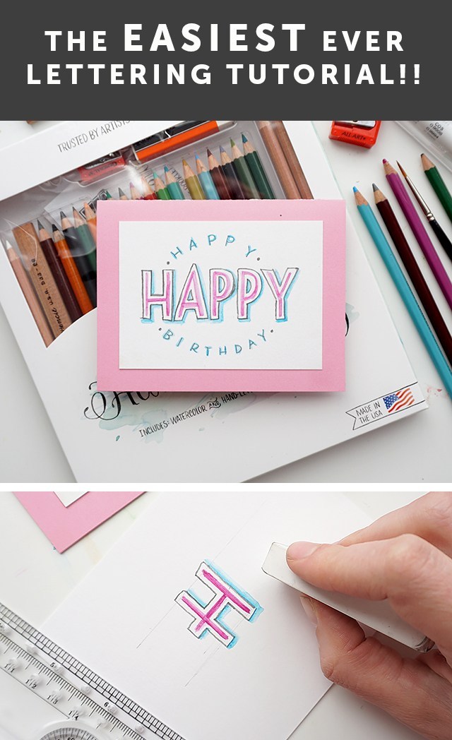
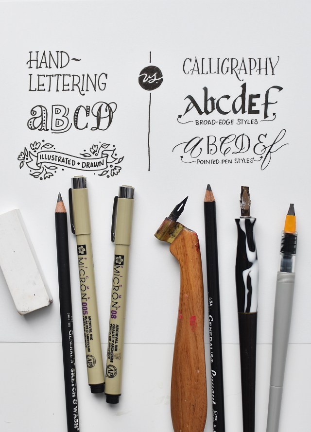
Now let’s talk hand-lettering!! Calligraphy and hand-lettering can be intimidating. Especially if you’re just starting out and teaching yourself. That’s where the humble, yet mighty pencil comes in. The pencil’s got your back. In fact, I have my online class students pull out the pencil before they touch any kind of pen or marker. The master penmen use pencils, so you can, too. I’m really excited to have shared this fun and simple technique on KSL’s Studio 5 on how to incorporate pencil lettering into your every day creativity. Let’s do this, shall we?!?

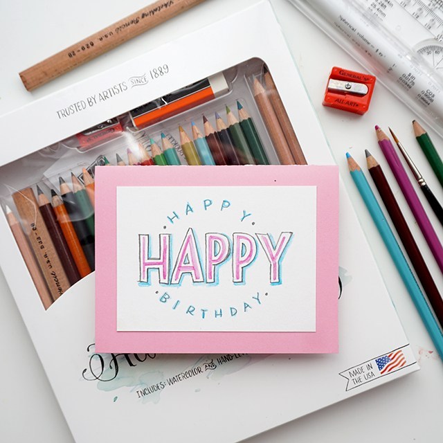
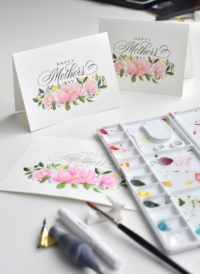
Isn’t this a fun card? You can totally make this in about 10 minutes. 

The cool thing about pencil is that you can erase it until you commit. So watercolor pencils you can erase until you add water. You can erase most pencils quite effectively until you commit by pressing really hard or going overtop in pen. You can see the difference between committing with pressing hard with a dark pencil on the right and a marker on the left. The cool thing is you don’t have to have fancy materials in order to be successful with your pencil lettering. Here’s what you need: 

  • Paper – use a mixed media paper if you’re using watercolor pencil.
  • Ruler – you gotta draw light grid lines or your lettering will be all over the place. Clear grid rulers are my fave.
  • Pencils – I’ve teamed up with General Pencil to create a pencil lettering kit, try it! It’s great.
  • Brush – I like small round brushes for this, but any brush you have on hand could also work!

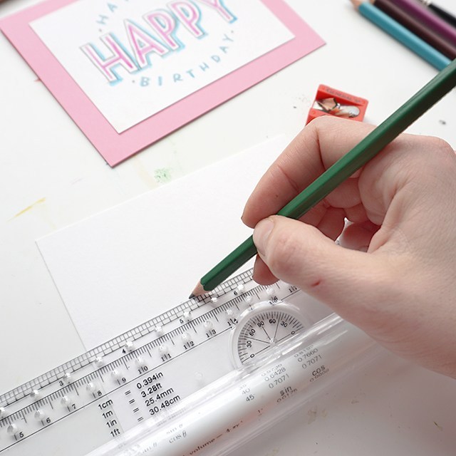
Step 1: Cut down your paper to size. I’ll leave it up to you as to what size you want to trim it down to. Get a ruler and mark out your top and bottom lines. The master penmen use a ruler to mark out guides, you should too. 

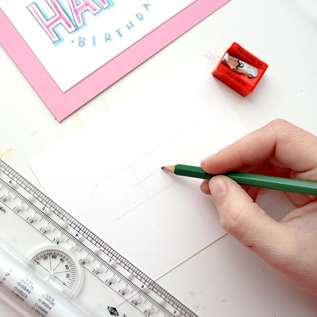
Lightly draft out your message. I find that short words in this style work best. Also, when drafting out your letters, make sure they’re generously spaced apart. Because we’ll be outlining around each letter, you’ll want to make sure you give yourself enough room for those outlines.

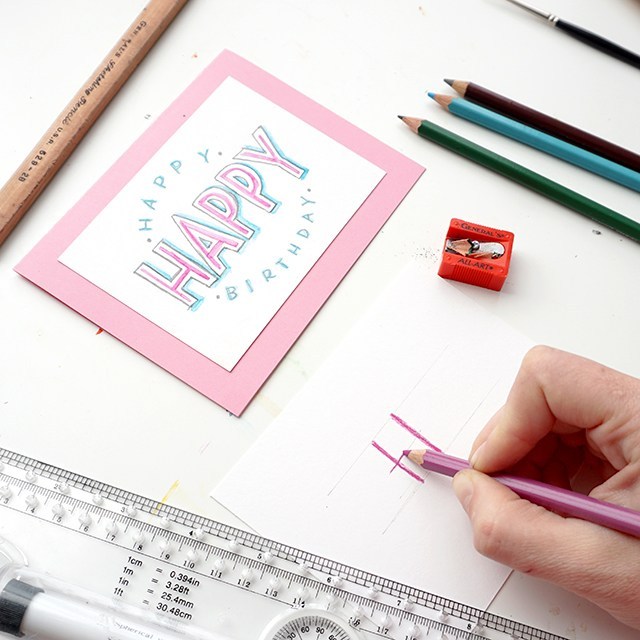
Grab a watercolor pencil and roughly mark out the outlines with watercolor pencils. For the sake of this style, pick two colors that you’d like to go together. Use the darker of the two colors for this part of the outline.

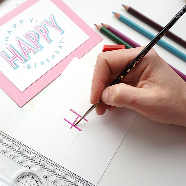
Wet a small round brush (this is a size 2 round) and smooth out the outline of your watercolor pencil.

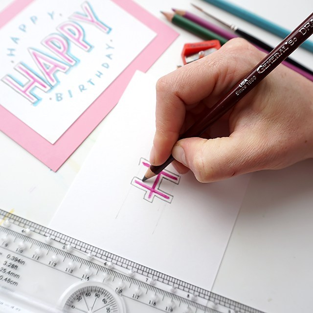
Leave a little bit of white space and outline each letter. I love the General’s draughting pencil for this. It’s hard enough to maintain a stable line, but it’s smooth and dark. 

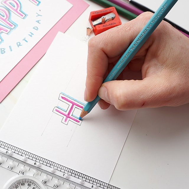
With your lighter color, outline the right-hand and bottom sides of your outline. You’ll use a light touch to lay down pigment to not disrupt the draughting pencil layer. 

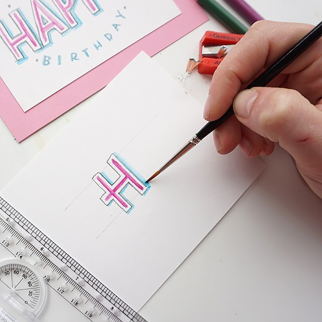
Using the same wet round brush, smooth out and soften the drop shadow you’ve created. 

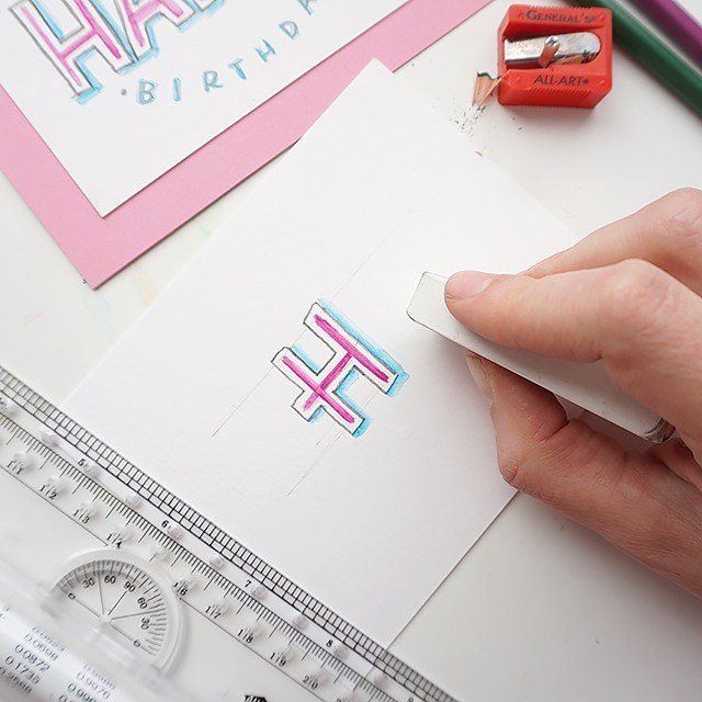
Once the watercolor is dry, erase away guidelines carefully. I like to use the corner of the eraser. 

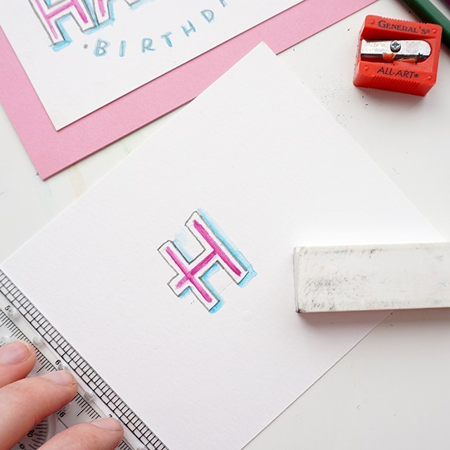
Bam! You’re done. You can send it as-is, or you can trace over the darker pencil marks in pen or marker to make the layout pop even more.

This tutorial is free for personal use. Affiliates are used to link to products I actually use and have. Your support here makes more content possible. Thank you!

Reflections Liner & How to Use One!

2 Comments

As requested by a couple of you fine folks who actually read this blog still (thanks, by the way!! ;)), I’m presenting a video with info on the Phantom Reflections Liner. 

This thing is a bit tricky. If you don’t get it quite right, you’ll have just slightly wonky lines that will make your work look just barely off. We don’t want that, do we?!? 

I mentioned it in my review of the laser square. I mention that the reflections liner is not that great. And it can be quite frustrating to use. But there definitely is a place for it. 

The cons:

  • You need a well-lit area.
  • You have to look through the viewing glass at the right angle in order to really see the angles, so that changes your orientation some. 
  • Looking through the dark viewing glass for hours can strain the eyes. 
  • It can feel bulky to use.

The pros: 

  • It’s old-school technology that doesn’t require batteries!
  • You can break it down for easy storage.
  • You can create guides of any shape, size or angle (for envelopes to full-blown pieces of art!)
  • It’s great for opaque or dark papers.

So without any further ado, check out the video explaining how to set up the phantom reflections liner: 

It’s basically like an analog teleprompter to broadcast your guidelines onto your paper. Brilliant little piece of equipment, right? Check out the above video for the full break-down of how to set it up. 

If you liked this video and others that I share here, consider giving my YouTube channel a subscribe! Check out my online pointed pen class (aka for learning “Modern Calligraphy”) over at calligraphy.org. I teach all sorts of things like how to understand the foundations, push your style so that it’s still readable and how to address envelopes. The class includes images, videos, text and one-on-one feedback from me & my co-instructor Erika. We help you troubleshoot, keep you motivated to continue through the coursework and answer any questions you may have. Feedback includes additional images and videos to help clarify and encourage. 

Register for my online class today. 

Tools used: 

Affiliate links are used, your purchases support additional videos and posts! Thank you!


Pilot Parallel Pen Review & Difference between Broad-Edge & Pointed-Pen

0 Comments

Thanks to Goulet Pen Company for providing us with the Pilot Parallel Pen Handlettering and Calligraphy Set. Both Hayley and I had a lot of fun playing around with these pens. I’ve had a few of these pens for a while, so it was fun to use the full line of pens from the Parallel Pen line.  

Before giving you my thoughts on the Parallel Pens, I thought I would give you a little info about calligraphy in general: Broad-edge calligraphy vs. Pointed-pen calligraphy. 

You’ve got hand-lettering versus calligraphy. Hand-lettering is illustrating letterforms. Often times letterforms take on a more dimensional look with decorative elements and illustrative affectations (above left). Calligraphy is the careful construction of letters with a prescribed set of strokes (see above right). Think of it as carefully writing each stroke, almost drawing each stroke. 

There are two camps within calligraphy itself: broad-edge and pointed-pen. Broad edge materials literally have a broad edge (see marbled holder and pilot parallel pen in the far right). The orientation and angle of the nib gives you the control over thicks and thins. But because of the broad edge, you’ll find that you have lots of thick strokes (see broad-edge styles). The broad-edge styles in the above image there are in no way exhaustive of the kinds of letters you can make with those tools. As a general rule, tools with number measurements like Speedball C-2, C-0, Mitchell 5mm, Pilot Parallel 6.0mm, etc. are all describing the width of the edge. 

Pointed-pen calligraphy, while using angle and orientation in order to work, relies on pressure in order for the thicks and thins to happen. As a result, you’ll find you can easily get sweeping fine lines and hairline flourishes with pointed-pen tools. When it comes to “Modern Calligraphy” that’s oh-so-popular, it’s referring to a pointed-pen script hand that’s based (although sometimes too loosely to be actually readable) on Copperplate/Engrosser’s Script foundations. This style needs pointed-pen tools. If you don’t, you’ll get messed up results like below:

SO…….. 

While the Pilot Parallel Pen Set may not be the right materials for “modern calligraphy”, this set is awesome for exploring a wide range of broad-edge styles in a variety of sizes! Without any further ado, check out the full review video. If you already know the difference, skip to 5:40.


Now for the review, we really loved these pens a lot! Here’s the breakdown of the pros and cons.

The pros:

  • Instruction packet for easy assembly
  • Variety of colored inks & black inks
  • Plastic nib/plate cleaner
  • Pens are juicy and synthesize dip pen beautifully
  • They travel well
  • They feel great

The cons: 

  • The artwork on the packaging is a little deceptive (you canNOT do brush lettering with these pens)
  • The “ductus” pages are made from fonts, not calligraphic hands*
  • You can’t put the caps on the ends of the pens while in use

*A “font” is a programmed set of letters used on the computer, a “hand” is a calligraphic style. The fonts in the ductus pages aren’t a bad place to start, but they don’t give you much information on pen angle/orientation or pen manipulation or stroke order. 

Overall, I’d say this set is a win. If you’re interested in trying broad-edge or bolder styles these pens are a must-have! They’re a great tool to take with you for practice on the go or even when attending workshops, meet-ups or guild meetings with limited space. 

Want to learn more about calligraphy? Check out my classes over at Calligraphy.org! 

Product provided by Goulet Pens. All thoughts are our own. 

Freebie: Mother’s Day Printable 2018

4 Comments

Coming at you super duper late, but late is better than never! I’ve been recently working on the 100 days project (follow along on Instagram right here), so I figured I’d rise to the occasion and add a watercolor floral element to this year’s card. Boy was it harder than I thought it would be! Maybe I’m just in a little bit of a slump (even though I’m only 1/4th of the way done). But I did it. And it’s done. And you can download it for FREEEEEEEEEE. Just for you. Or your mom. Or for you to give to your significant other to then write a note in and give to you. 


I don’t necessarily go for gifts on Mother’s Day, but I must get a note from Chris. When I don’t, I get a bit sour about it. A little heart-felt thanks goes such a long way; afterall, momming is so freaking hard!!

And if you or your loved one isn’t in the motherhood way, this holiday can be oh-so-tough. Send her a you-are-an-amazing-woman card, see printable here. Seriously. DO IT NOW. 

I thought I’d take a different approach and walk you through the process of making this card. I made a few minor tweaks in Illustrator with the text and layout, but basically I scanned in the image and brightened the background for printing. Inspirations for this layout came from Natalie Malan & Esther Peck.

I really hope you’ll use this download! Check out even more Mother’s Day printables below: 

CLICK HERE TO DOWNLOAD

This freebie is for personal use only, redistribution, remixing, or reselling is prohibited. If you’d like to use this for commercial purposes, please email me at melissa@melissaesplin.com.

Spring Motivational Quote Printable

0 Comment

I’m on Studio 5! It was so fun to go on to film this segment. I wanted to do something that related to spring and new beginnings and starting anew. So I found this quote as a little motivator. See the end of this post for the free file to download. FREE FOR PERSONAL USE ONLY. 

WORKSHOP SCHEDULE!!

I’ve got 2 workshops coming up next month! Be sure to sign up before spots sell out! 

Modern Calligraphy Workshop – April 6th 5-8pm in Draper, UT! Learn basics of modern pointed pen calligraphy. 

Brush lettering & Watercolor Workshop – April 21 9-5pm in Bluffdale, UT! Come to Cents of Style headquarters for a DAY filled with watercolor, calligraphy, food and creativity. 

Who doesn’t need a motivator like this? I mean come on! I think you could print this out and mail it to your buddies who you know may be struggling through something. Even the most beautiful flowers still have to grow through dirt (and sometimes manure). I’m totally obsessed with Natalie Malan’s floral skills, so I thought i would put her most recent paper pack to good use and print the quote on there! It was easy peasy. See below for instructions and tools. 

Tools: 

Print out the quotes on a laser printer. If you don’t have one at home, head to your nearest copy center and have it printed on black and white on your desired paper. I loved how substantial this Natalie Malan paper pack was, but it went through my laser printer no sweat. 

Then turn on your laminator in the highest heat setting. Once it’s ready, cut out a piece of foil the size of the lettering (as to not waste foil material). Lay it overtop the printed area, slip inside a folded sheet of parchment paper and send through the laminator. 

Pull it out and remove the foil. TADA!! It’s done. 

I did experiment with watercoloring on plain paper after I did the foil transfer and it worked quite well! The chalkiness of the beginner paints, however stuck onto the foil so it wasn’t as mirror-like and shiny where I painted overtop the lettering. But it still turned out ok. Just an option. 

CLICK HERE TO DOWNLOAD THE PRINTABLE

I know it’s super simple, but it’s so fun to add a little bit of gold sparkle to some pretty decorative paper! 

And if you don’t have access to gold foil, just print it black and white!! Look at how pretty just the black and white turned out….

This freebie is free for personal use only. Alteration or redistribution of this file is prohibited. If you’d like the artwork for commercial use, please contact melissa@melissaesplin.com.      

Affiliate links are used. Sales from these links help support this blog and the content created here. Thank you!

mobile site