Posts Tagged ‘calligraphy’

Spring Motivational Quote Printable

0 Comment

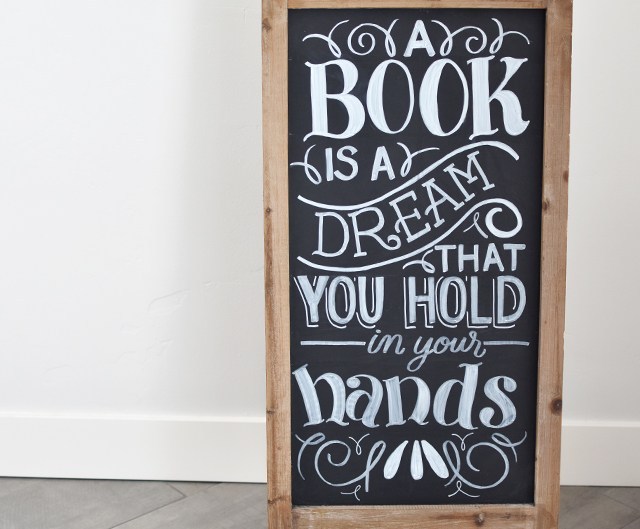
I’m on Studio 5! It was so fun to go on to film this segment. I wanted to do something that related to spring and new beginnings and starting anew. So I found this quote as a little motivator. See the end of this post for the free file to download. FREE FOR PERSONAL USE ONLY. 

WORKSHOP SCHEDULE!!

I’ve got 2 workshops coming up next month! Be sure to sign up before spots sell out! 

Modern Calligraphy Workshop – April 6th 5-8pm in Draper, UT! Learn basics of modern pointed pen calligraphy. 

Brush lettering & Watercolor Workshop – April 21 9-5pm in Bluffdale, UT! Come to Cents of Style headquarters for a DAY filled with watercolor, calligraphy, food and creativity. 

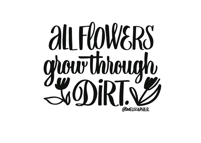
Who doesn’t need a motivator like this? I mean come on! I think you could print this out and mail it to your buddies who you know may be struggling through something. Even the most beautiful flowers still have to grow through dirt (and sometimes manure). I’m totally obsessed with Natalie Malan’s floral skills, so I thought i would put her most recent paper pack to good use and print the quote on there! It was easy peasy. See below for instructions and tools. 

Tools: 

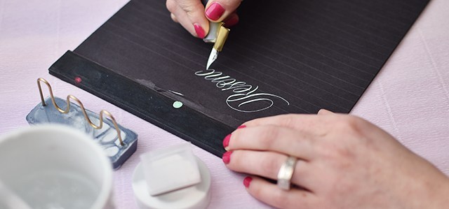
Print out the quotes on a laser printer. If you don’t have one at home, head to your nearest copy center and have it printed on black and white on your desired paper. I loved how substantial this Natalie Malan paper pack was, but it went through my laser printer no sweat. 

Then turn on your laminator in the highest heat setting. Once it’s ready, cut out a piece of foil the size of the lettering (as to not waste foil material). Lay it overtop the printed area, slip inside a folded sheet of parchment paper and send through the laminator. 

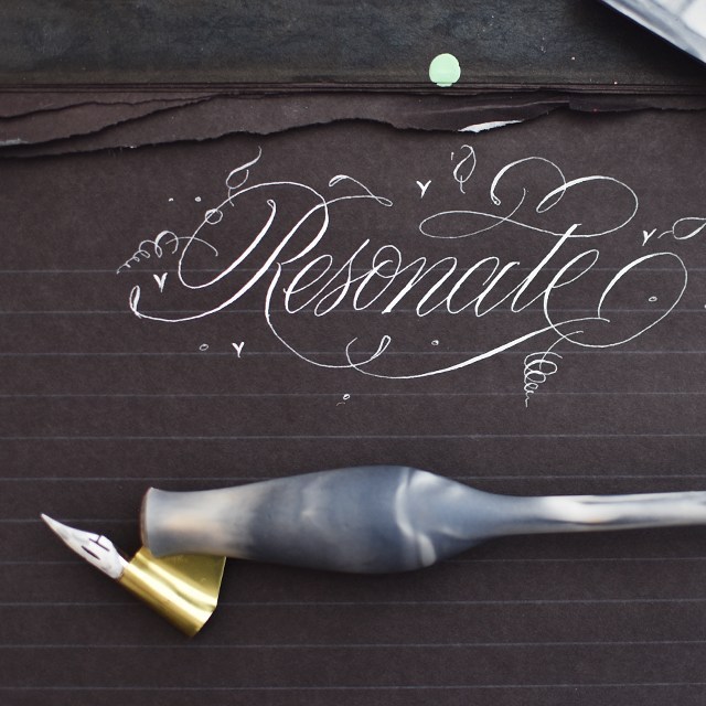
Pull it out and remove the foil. TADA!! It’s done. 

I did experiment with watercoloring on plain paper after I did the foil transfer and it worked quite well! The chalkiness of the beginner paints, however stuck onto the foil so it wasn’t as mirror-like and shiny where I painted overtop the lettering. But it still turned out ok. Just an option. 

CLICK HERE TO DOWNLOAD THE PRINTABLE

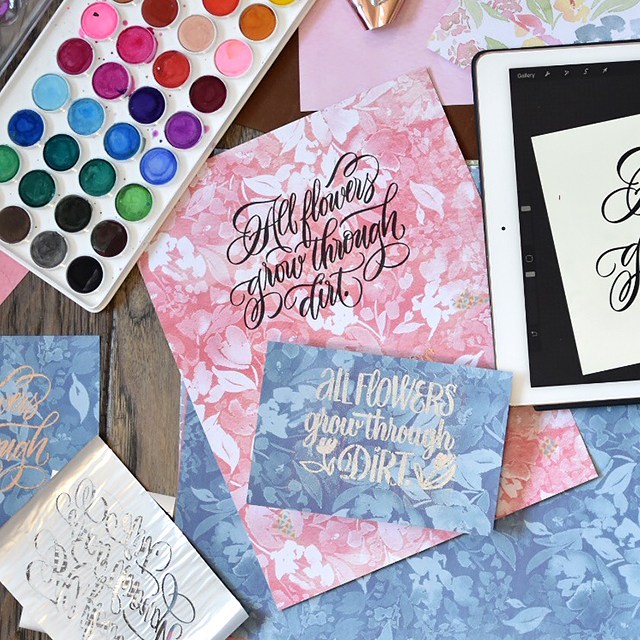
I know it’s super simple, but it’s so fun to add a little bit of gold sparkle to some pretty decorative paper! 

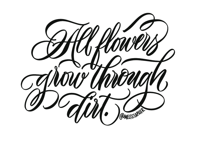
And if you don’t have access to gold foil, just print it black and white!! Look at how pretty just the black and white turned out….

This freebie is free for personal use only. Alteration or redistribution of this file is prohibited. If you’d like the artwork for commercial use, please contact melissa@melissaesplin.com.      

Affiliate links are used. Sales from these links help support this blog and the content created here. Thank you!

Progress Takes Time Flourishing Video Comparison

5 Comments

I didn’t get good overnight. In fact, I still have a long way to go. I have more classes to take, more practice to do and more tools to hoard. Last week I came across an old video I uploaded in 2013, I had had some practice under my belt. But not much. I was proud of this work: 

OMG. 

Now that I look back, I cringe. I should cringe at old work. Sure there are some pieces I’m still proud of, but would I keep working on improving if I didn’t find my old work a little cringe-worthy? Probably not. Dare I say that embarrassment feeds improvement? Maybe a little? 

So as one does, I re-did my old video. I’m happy with how it turned out. I’ve gotten better at my filming and editing process. I’ve gotten better at my flourishing and overall technique. But is this the end? Hardly. 

Tools used: 

I think my biggest pet-peeve is when a person or class claims the end or height of learning. You know that’s an utter lie. And if someone ever claims that, you know they don’t know beans about what they’re teaching or doing. Learning and improvement never stops; no matter the discipline or art form. I teach calligraphy. And I love teaching calligraphy. I love getting people started and seeing them run with it and graduate beyond my class to other classes, other disciplines, other passions to create a style that they truly own. 

If I were to critique this piece? I’d say the flourish coming off the ‘u’ is a little awkward. I should have done it off the ‘r’. And I should have written out a baseline guildeline, because I’m bouncing around with a little less purpose than a meandering baseline. And my ink got thick on the ‘sh’ connection. But good grief, I’m getting better.

The other thing is… I had a slew of negative comments on that old video. Someone told me to stop lettering all together, because I sucked. I ignored them, I think because I never got the notification of the comment in the first place (win!). I’ve got a little PSA for you… EVERYONE SUCKS WHEN THEY FIRST START ANYTHING. I was no exception. So what’s keeping you from learning something new? It’s okay to suck a little. It’s okay to suck a lot. Just keep at it. 

Want to see the before in action? Oh yeah….

Want to get better at calligraphy? Let me help you. I teach calligraphy online and in person (in Utah). You can register for my online class right here. I give personal one-on-one feedback to help you with targeted improvements. And my next in-person workshop is April 6th in Draper, UT. Register here.

Don’t get discouraged by slow improvement. With social media and instant gratification we’re used to with everything at our fingertips, it’s easy to get discouraged. Learning a new discipline takes time. And that’s okay. Doing something that’s not perfect is okay, too!! I don’t regret publishing that old video for a second. I put out the best I could do at the time. And I was proud of it! I look at that old video like a badge of honor.

Review: Resonate Collection Review from Ash Bush

0 Comments

I’m really, really excited about the review that’s coming at you today. Ashley Bush is one of the early calligraphy.org students. She’s made an incredible business of freelance calligraphy and pensmithing. It’s so exciting to see when students really run with it and make calligraphy into a career. 

Ashley recently reached out to me to try out her resonate line. I’m really thrilled with how it’s turned out. It’s affordable, instagrammable and most importantly: comfortably functional. At $30 for these gorgeous marbleized pens, you really can’t go wrong. See the pen rest, tilted ink holder and pen holder in action in my YouTube video below. 

VIDEO DETAILS: 

But if you’re not the video-watching type… Here are my pros & cons of each item offered in the collection…

HOLDER $30

PROS: Affordable, smooth/silky finish, easy to clean, made from resin so it won’t split, carrot holder for promoting whole arm movement (also a great holder style for arthritic hands), flange adjusted and pre-fit with a G-nib

CONS: It’s a little short. It feels nicely balanced in the hand, but I personally wish it were a little bit longer. I wouldn’t mind an angled foot, either. But the foot is still small enough for a carrot holder that it fits in most ink jars. 

PEN REST $9

PROS: Holds 2 holders for easily switching styles, pretty, heavy enough base that it doesn’t topple over.

CONS: has a slightly different finish on it than the pen, it’d be nice if it had the same matte finish. Not a deal breaker by any means. 

TILTED INK HOLDER $7

PROS: It tilts the jar just enough that you can get that last little bit of your ink out of the jar. It really works with very little ink!

CONS: It doesn’t do well with full jars of ink. I wish there were a second well that was upright for me to hold my ink when the jar was full, and then tilt when the jar was nearing empty. But I really rarely put my full ink jars in an upright inkwell holder anyway, so it might just be superfluous. 

BOTTOM LINE: It’s a no-brainer. Scrounge up $50 and snatch up the entire collection. But at the very least, get the holder. It’s a must. It’s so so good. GET ONE RIGHT HERE.

Best Tooth Fairy Ever

0 Comment

We have a killer Tooth Fairy. Not in the creepy horror film way, but in the OMG-she-totally-knocks-it-out-of-the-park sort of way. She’s amazing. Not to toot her horn too much, but she’s a darling little 6″ sprite that writes the sweetest little love notes to Penelope. They even have occasional back-and-forth correspondence that’s total cuteness overload. 

We don’t have many ridiculous or time-intensive traditions at our house. Really, we don’t have many traditions at all. But this is one that really jives with our family core values. It’s creative. It’s cheap. It makes my children’s childhood magical. 95% of the time the Tooth Fairy has her act together, but some times she’s busy. And she gets the tooth the next night. But she usually includes a very heart-felt apology in her little love note the next night. 

Cute dress from the ever darling My Sister’s Closet

I age restricted the video in case little eyes come across the video. Let me know if that’s an issue. I’m still pretty new to this whole YouTube publishing thing. Click on over to YouTube if you’d like to subscribe to my weekly videos. Content includes creative art-related DIYs, art material reviews and lettering/calligraphy time-lapse videos. I’d love it if you subscribed, but you do you. ;)

So here’s what you need: 

Knowing calligraphy isn’t an absolute must*, but it certainly helps. ;) I can teach you how. 

Since I have a Silhouette machine, I downloaded an envelope template from the Silhouette design store and resized to my liking. The final envelope size is somewhere between 1″-1.25″ wide. The letter is about 3/4″ wide and 1 1/2″ tall. So these letters are TINY! It’s what makes them so fun. If you’ve got a Silhouette, resizing an envelope template and cutting out on your machine is easy-peasy. I have cut out envelopes by hand before. Not the most fun thing in the world, but also not the most time consuming thing ever, either. 

The paper listed above handles ink really well. If you’re using a very fine point pen (Sakura has .003 micron pens that will give you a ridiculously small point), then any kind of smooth paper will do. 

If you’re using pen & ink, the Modern nib alternative to the one in the video (the Leonardt Principal) will get you a nice fine hairline. Make sure you use a fine ink as well. I prefer walnut as it’s easy to use and it doesn’t corrode your nib like iron gall inks do. 

Once you’re done with writing your note, fold up the note to fit inside the envelope. Wrap the envelope flaps around the note and seal with a wax seal. You don’t have to glue the flaps closed because the wax will do the work for you. I use wax seal wax and a drill bit to make a fun imprint. 

Then grab your dollar bill and fold it into something exciting. These are my favorites out of the ones I’ve tried:

Then tuck the envelope in one of the folds of the animals and you’re done! I’m sure it’s easier for the Tooth Fairy to slip a buck under the pillow and be done with it, but this is just straight up magical. Let me know if you end up doing this with your kid(s)!


Affiliate links are used. Your price doesn’t change, I get a small percentage of each sale from these links. All proceeds from affiliate sales goes towards making new videos like these. Your support is greatly appreciated!

Time-Lapse Chalk Board Project

0 Comments

I teamed up with my assistant Hayley to letter these quotes on a double-sided chalkboard. We had a fantastic time hanging out, chatting and doing our favorite thing: lettering! I had 3 cameras set up. Unfortunately the two end cameras that show us lettering cut out in the middle of our process. And my shoulder is covering my hand basically the entire time. But I still thought I’d edit the footage together and share it on my YouTube channel. If you’re not a subscriber already, throw me a like or a subscribe if you like it! I’m publishing a new video each week. It switches up between time-lapse lettering, real-time lettering, art/material reviews and art tutorials. It’s all very art-related with a heavy lettering emphasis. And every tutorial and art product could be used for calligraphy. So yay to me for being focused on something!! lol. 


Find Hayley and me on Instagram:

@typeaffiliated | @melissapher

Materials used (purchasing through my affiliate links below support more videos, THX!):
General charcoal pencil
T-square
Versa chalk
ZIG posterman
Sumo grip eraser

Learn how to do chalk lettering with actual chalk right here.

Buy awesome art prints and originals at typeaffiliated.com!

Basic run-down of how we did this: I took a pic of the chalkboard with my ipad and lettered the layout on there. That gave me a rough idea of where to make guide lines. Then I chalked up the guidelines and markered everything in. BOOM. DONE. Took just over an hour for my side. Hayley was faster. Because she’s a lettering baller. 

This project is for a classroom reading nook, so we wanted the signage to be relatively permanent, hence the chalk markers versus the actual chalk. The cool thing about that is that it makes cleaning up chalkboards a breeze. We used the General Pencil white charcoal to mark up our guidelines and the Sakura SumoGrip eraser to erase them effortlessly after we were done. No white erase marks. No mess. And it didn’t even take off the chalk marker once it was dry either! WIN! 

I might have gotten a little carried away with decorative elements.

Hayley kept it clean, playful and readable. Afterall, it is a reading nook for an elementary school. And most elementary schools don’t teach cursive anymore. So as a result, most kids don’t know how to read it either. It’s the saddest thing. Isn’t the ‘m’ in “dream” just lovely?!? OMG. 

I hope you enjoyed seeing the process video and a little bit of the behind-the-scenes of how we made these chalkboards. 

mobile site