Posts Tagged ‘web’

Redesigned: The Girl Who Wore Everything

6 Comments

During Chris’s two and a half weeks of Christmas vacation, we spent our time redesigning a few blogs. We had a grand time working together & making the interwebs a tiny bit prettier. I’ll be sharing a finished project each week along with a design tip (or two) for a better blog.

M from The Girl Who Wore Everything was another fantastic client to work with. She she wanted her blog to look more professional & convey her love for fashion (and sparkles!). Her blog was a fairly blank slate to work with, she didn’t have any insane templates going on and she didn’t want anything insane, either.


I liked the glasses she was wearing in the header the presence of white space in her old design. So I incorporated those two with more fashion-iconic typefaces, glitter and a more grown-up color palette and voila!

For the fonts I used Baskerville semibold italic and Open Sans Condensed Light. For the glitter, I made my own using Pugly Pixel‘s & Scrapbook Bytes photoshop glitter tutorials. I made an animated gif of the bloglovin button so the glitter actually sparkles (FUN!). Check out The Girl Who Wore Everything to see the design in action.

 • DESIGN TIP #4: LEARN MORE, DESIGN LESS •

There are so many fantastic resources for expanding your design knowledge. My favorites are: Nicole’s Classes, Pugly Pixel, Lynda.com. There you can begin or expand on your knowledge of design-based programs like Illustrator & photoshop. All have been a fantastic resource for me as I have been trying to branch out of my very 2-dimensional design box. Go check them out.

I’m definitely speaking out of experience/mistake here, but as you do learn new tools for photo editing and design you don’t need to use all of the tools all at the same time. I remember as I was learning photoshop my freshman year of college, I applied 4-10 filters to my projects and quickly realized that many of the tools offered in these programs are spices, not staples. In illustrator, I typically stick to 2-3 tools. In photoshop, it’s about the same. This same principle applies to blogs as well. Keep it simple.

Do you have any favorite resources for expanding your design knowledge?

Redesigned: Fantabulously Frugal

9 Comments

During Chris’s two and a half weeks of Christmas vacation, we spent our time redesigning a few blogs. We had a grand time working together & making the interwebs a tiny bit prettier. I’ll be sharing a finished project each week along with a design tip (or two) for a better blog.

It was my sincere pleasure to work on the site: Fantabulously Frugal. Lisa was a gem to work with!

Before I got started the elements on the page had no heirarchy & the ads weren’t very organized. A lot of the work involved in this redesign was on Chris’s end of things, with reorganizing the sidebar so that it would read well on the page AND so that it could be easily editable on Lisa’s end of things.

There were a few things I did like about her blog & incorporated in the redesign: unexpected color palette, stripes and handmade elements. Since her site is deal/ad-based, I felt like the handwritten details made it look more approachable, but then kept it professional looking. I made a very fine diagonal stripe for the background & softened her color palette to a charcoal/navy/purple color family. Doing this redesign was so satisfying; like organizing-my-closet-by color-with-all-matching-hangers satisfying.

What do you think? Head on over to Fantabulously Frugal for the full after (and for info on killer deals).

• Blog tip #3: DESIGN + ADS •

If you’re thinking about starting a blog with ads or you’re planning on adding advertisements to your current blog; you need to know standard ad sizes. We talked about this a little bit at Alt this past year. Large companies that are looking to advertise with Google or ad networks use standard sizes for their ad campaigns. Check out IAB for standard ad dimensions, file sizes & animation length. It’s a fabulous resource for bloggers & companies. See below for the most popular of the standard ad sizes:

  • Leaderboard: 728 x 90 pixels
  • Medium Rectangle: 300 x 250 pixels
  • Wide Skyscraper: 160 x 600 pixels

Big Changes and Little Details

4 Comments

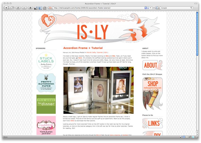
picture-2

IS•LY just underwent a much-needed face lift recently and I have a lot to thank Chris for. I did all of the design work, but Chris made it happen. Goodness, it sure does help to have a web developer that’s unconditionally in love with you. ;) Most of the effort (on Chris’s behalf) was put into the sidebar buttons. You should check them out. Seriously. Chris spent a couple of hours researching and figuring out how to get the rollover to work, and last night he was successful. Looking to pimp out your blog? Here are some helpful links:

Hex Color Combo Tester

Favicon Tutorial

Image Rollover Tutorial

mobile site