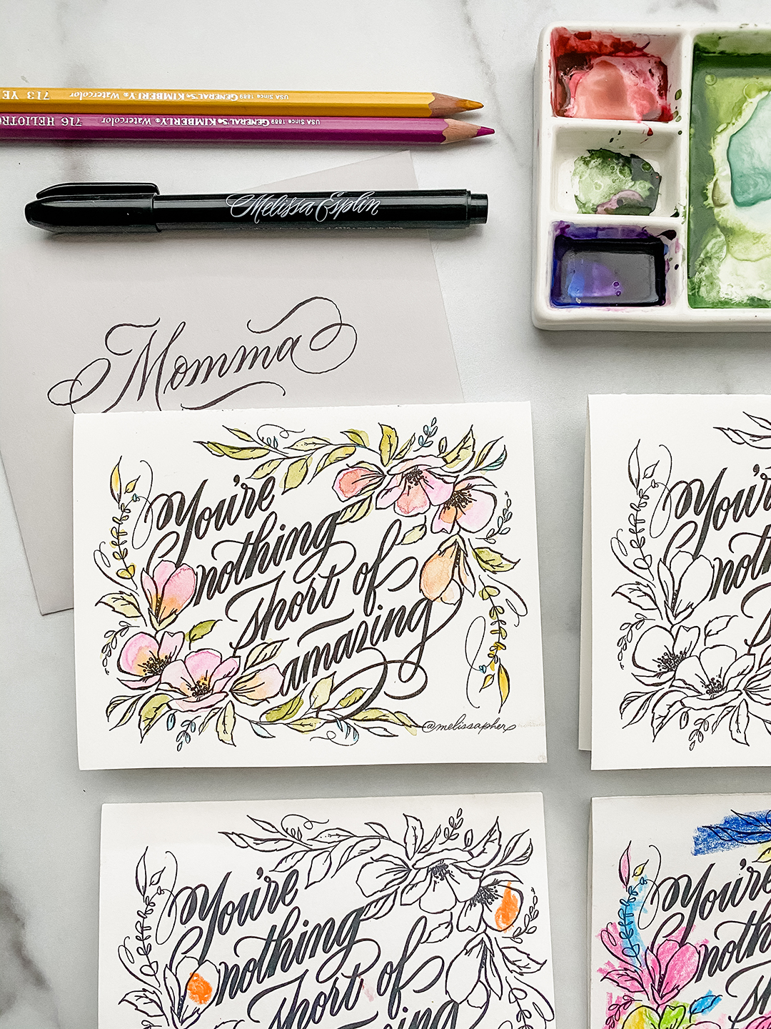
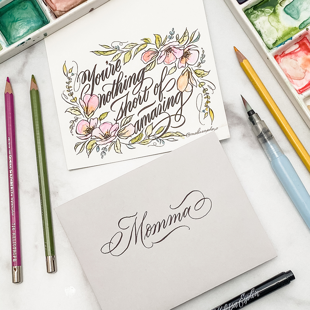
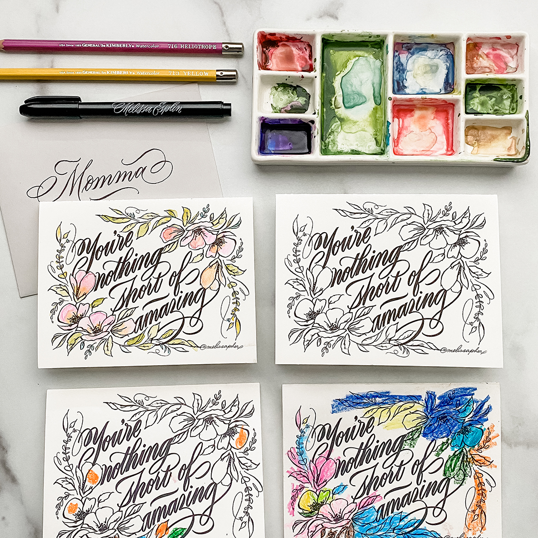
This idea came to me last night. A little late, you might think? Well, if it’s late, just use this for next year. Or really any time you need to tell someone they’re amazing. Because this is really for just about anyone. But we all can agree that mothers tend to crush it in the amazing department on the regular.
SCROLL TO THE BOTTOM TO DOWNLOAD.
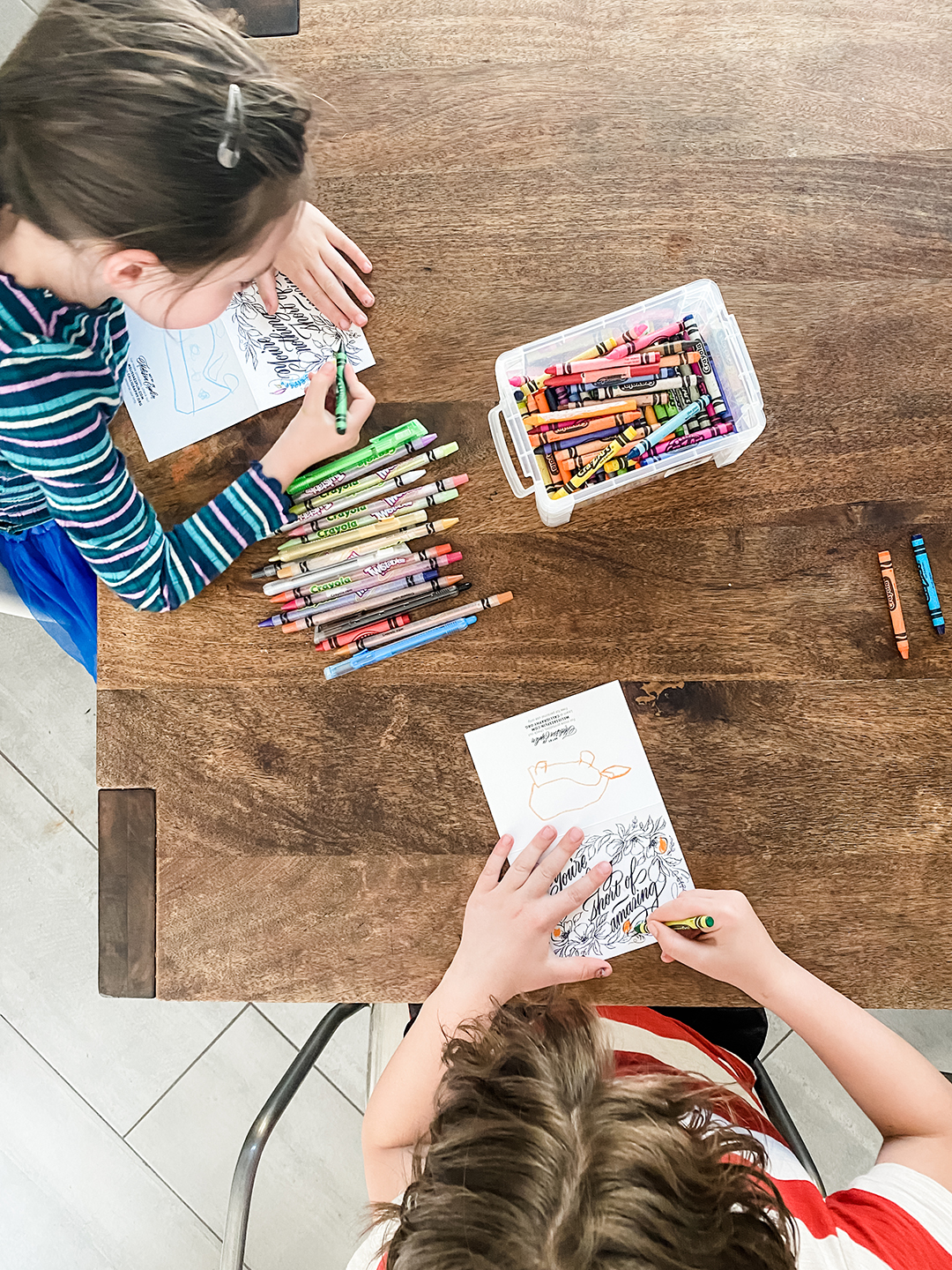
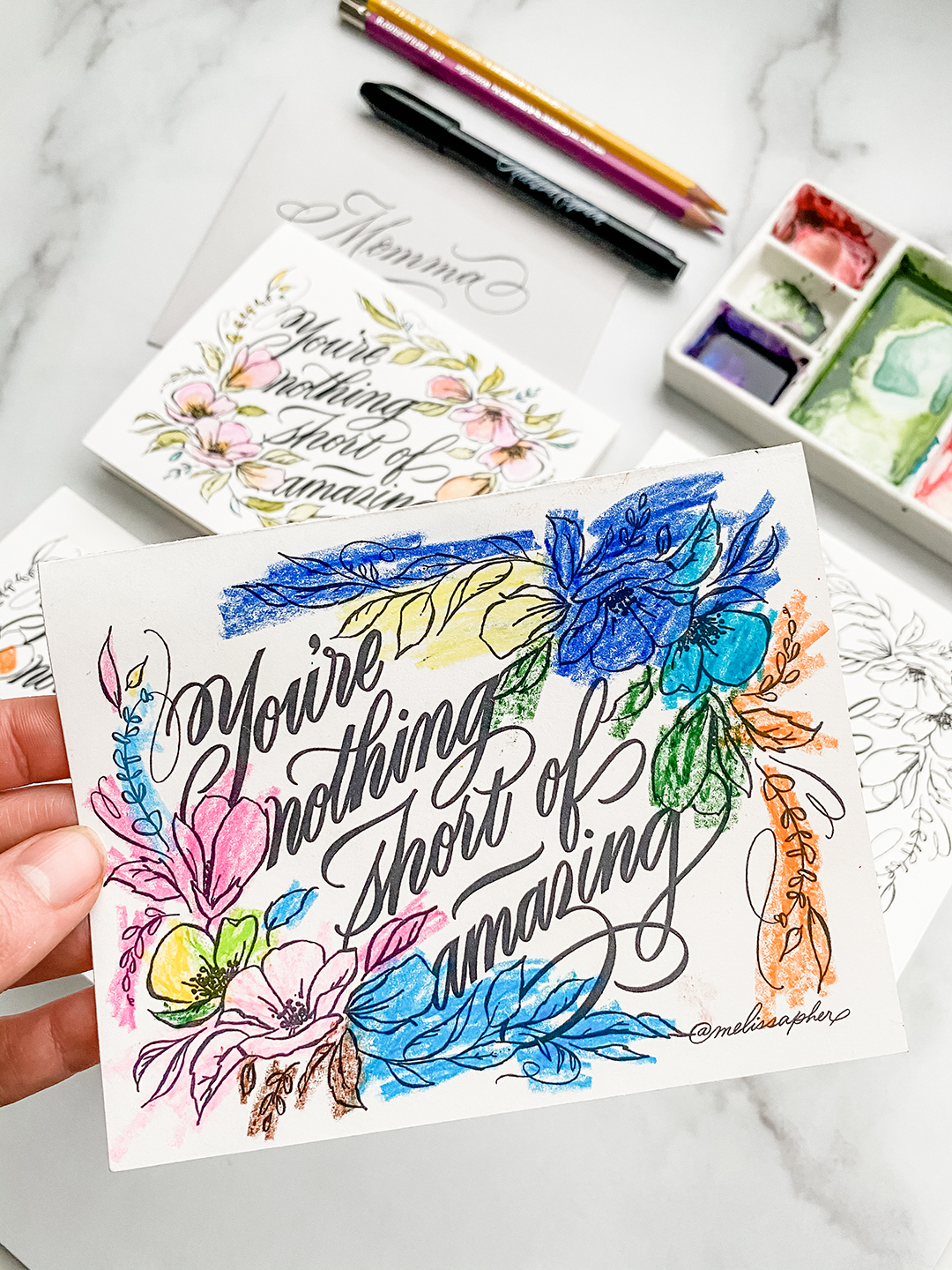
Since we’re all bored and stuck at home, I thought I would take a coloring book approach with the cards this year. Send the card as-is, black and white, or have your little ones color them in (or you can color them in) for that added personal touch. These cards are one-sided, two cards print to a page and in black and white. So, this is about as low maintenance, low-fuss as you can go and still make a great impact.
I had a blast making my kids color these cards for their grandparents. I hope you do too!!
For best results: use crayons or a non-liquid pigment like colored pencils if you’re printing with an ink jet printer. If you’re printing with a laser printer, feel free to bust out those watercolors or fabulous markers you’ve got lying around.
Click the above link to download/print the artwork. Artwork is free for personal use only. Alteration, reproduction or redistribution is prohibited. If you’d like to share with family and friends, please send them directly to this post. Your support is greatly appreciated.
Hopefully this helps as you explore calligraphy more. Let me help you even more on your path to making beautiful, readable calligraphy in your own distinctive style. My Modern Calligraphy workshop includes personal coaching to help you along every step of the way with your calligraphy journey and explorations. I have a brush lettering class too!
Explore handlettering with me at Utah Pinners on Nov 2 at 2:30. To use your promo code, click here and use code ESPLIN for 10% off through GrowTix when you purchase your tickets. Be sure to pre-purchase your kit for bonus goodies!
Not all paper is created equal. Chances are, if you’re just starting out, you may have found some issues with your practice. Or if you’re not a beginner you had issues when you were just starting out. And maybe you’d like to find some new papers to try out!
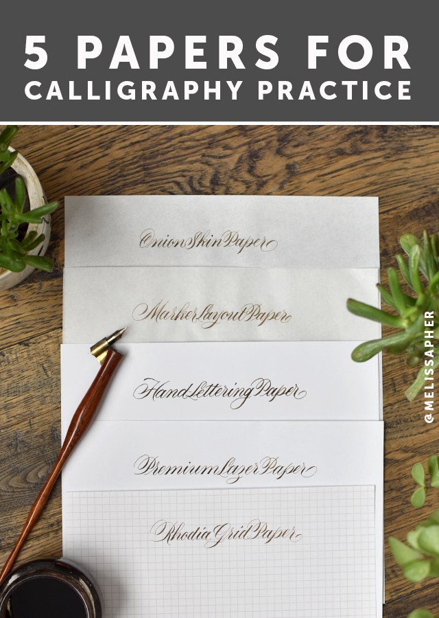
One of the most frequent questions I get asked is, “What paper do you use?”. That’s a loaded question. For now, let’s talk about practice papers. Read the full post below for all the nitty-gritty details for why I like these papers, or watch the video. :)
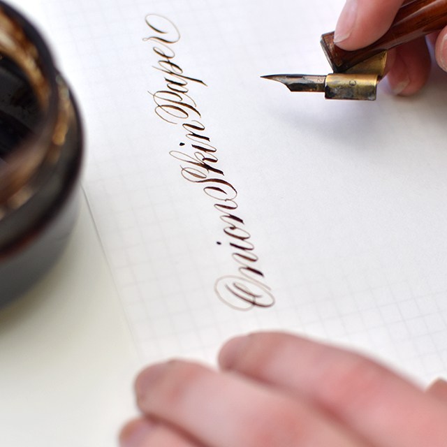
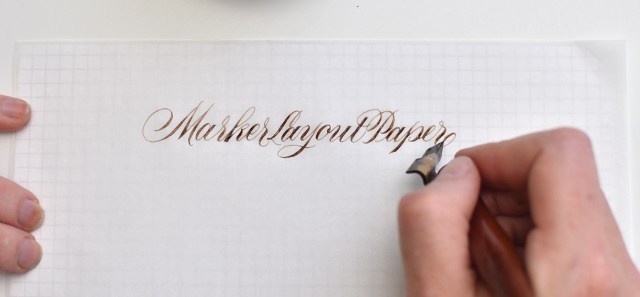
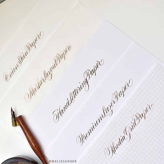
For the sake of this post, I’m using a Hunt 22 nib and Walnut ink on all papers so you can see how each paper handles ink. Also, never mind the fact that I can’t seem to spell the word “laser” correctly. I don’t know why I always get the ‘s’ and the ‘z’ mixed up with that one. The same papers that work with pointed pen also work with pointed brush. When looking for a good practice paper for both pointed pen/modern calligraphy and pointed brush/brush lettering, look for a smooth surface that allows the writing instrument to glide smoothly across the paper and a paper sturdy enough, or well-enough made that it holds ink without bleeding or feathering. These are my go-to calligraphy papers that I seem to always have on-hand.
I’m going to go through each paper from most transparent to most opaque and list out each paper’s pros & cons and links (affiliated*) to where to purchase:
PROS: This paper is very smooth and handles ink beautifully. It’s about as transparent as tracing paper, but without the drawbacks. It’s about $30 for an entire ream (500 sheets), which makes it a great value. You can easily slip guidelines under your paper as pictured above and remove them for scanning or photography.
CONS: There’s really only one brand and one place (the PaperMill Store) where it’s available (amazon is a LOT more expensive). It doesn’t go through the printer well (but no need with its transparency). I’ve noticed some friends complain it can be a bit too smooth.
PROS: Marker Layout paper is easily accessible, you can purchase it from just about any craft supply store by the pad. It’s nice you can contain your practice within a pad, and it’s semi-transluscent so you can easily put guidelines underneath as pictured above. It’s okay for scanning, but has a little more tooth to the texture of the paper (that can be a pro or a con). Every marker layout paper brand I’ve tried (Canson, Borden & Riley, Strathmore, etc) has performed consistently. I find I prefer Canson out of this category.
CONS: At between $9-13 per pad with only 50-80 sheets per pad, this is more expensive than onion skin paper. It comes in 9×12 pads, so you have to cut them down smaller if you’re looking to print on them or to scan them in standard-sized scanners.
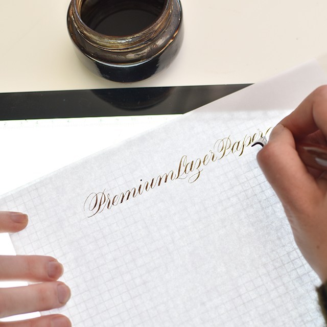
PROS: There are many brands of premium laser papers out there, so I keep this pretty generic. Many that I’ve tried have worked great with ink. HP Premium Laser Paper is the most popular of this bunch. I’ve had great luck with Hammermill as well. What to look for: 32lb, Laserjet compatable, premium paper. Regular copy paper will ruin your life. This is probably the most economical and easily sourced option of the lot. You can print guides directly onto this paper.
CONS: It’s more opaque, so you’ll need to use a lightpad or print directly onto your paper with a local or at-home printer. Depending upon the brand you’ve purchased, it may have a bit more of a tooth to it. No worries. Just make sure you’re practicing with a light touch (like you should be doing anyway).
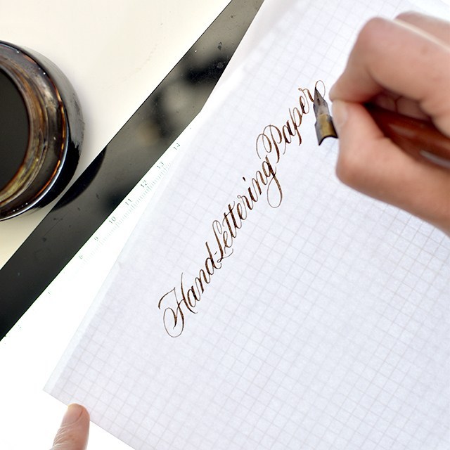
PROS: This paper is a hybrid paper. While it’s still considered a practice paper, the weight and quality of this paper could be used as a finished paper. It’s probably the thickest paper of the lot. It’s incredibly smooth, shows a nice bold line and the ink lays evenly on the paper. This paper handles more liquid media than the other papers of this type, so you can practice with wet ink, thicker downstrokes, experiment with watercolor effects without the paper buckling. This paper comes in larger sizes for larger work.
CONS: It’s a little harder to source this paper than the others, but it’s worth trying if you’re curious. It’s a thicker paper, requiring a lightpad or really dark guidelines to go underneath the paper. Or, worst case scenario, using a pencil to draw out your guidelines.
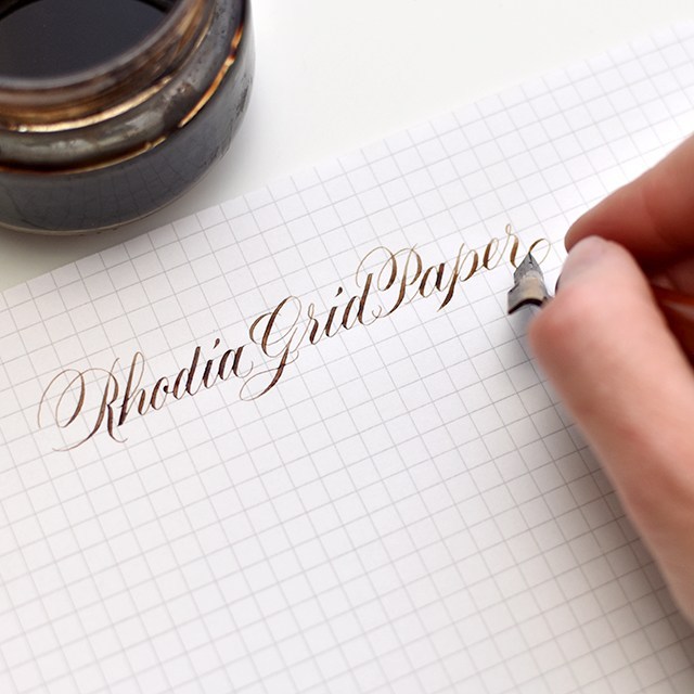
PROS: Rhodia graph paper already has gridlines on it!! You can find their dot pad, if grid lines are too much, but I really like the structure of the grid. This paper is beautifully smooth and handles ink like a pro. It’s got a little bit of texture to it, enough to give your pen feedback on where you are on the paper, but not so much that your nib is skipping all over the place. Grid lines are 5mm apart
The Engrosser’s Pad from John Neal is also great (make sure to purchase the one labeled “engrosser’s pad” if you’re doing pointed pen), it also includes 55º angle lines for keeping angle lines consistent. The grid markers are quite small at just over 3mm (1/8th inch), so it can be a little harder to keep track of the sizing if you’re going for a larger scale.
CONS: If you get the Rhodia ICE pad, the grids come in a light grey, which means you can’t scan out the grid lines if you’re digitizing your work. It’s a premium paper (from a French company, so regal ;)), so it comes at a premium price. Thankfully, with the rise of calligraphy and lettering in popularity, the pricing and availability for these pads has become more accessible. The regular orange Rhodia pads have a blue grid that can be photoshopped out, but it’s a little tricky.
Hopefully this helps as you explore calligraphy more. Let me help you even more on your path to making beautiful, readable calligraphy in your own distinctive style. My Modern Calligraphy workshop includes personal coaching to help you along every step of the way with your calligraphy journey and explorations. I have a brush lettering class too!
Learn brush lettering based on more traditional foundations and how to manipulate those foundations to write some funky letters! All skill levels welcome, but it is geared more toward beginners. Lefties welcome!
Learn the art of beautiful penmanship and how to harness your own style to tell your story. This is perfect for beginners, lefties and future brides! We’ll go through foundations, style and how to address an envelope.
Join me in Nashville for a whole lot of fun with a 2-day lettering intensive with the pointed brush. We’ll dig deeper than in any other class in the two days. We’ll go letter-by-letter through variant options, work on word and compositional structure and style structure. At the end of the class, we’ll work on the beginning essentials of digitization by making our own personalized stamps with our artwork. All skill levels welcome.
I hope I can see you at one of the above workshops this summer. We always have a blast and I try to pack as much information as possible so you leave the workshop motivated, empowered and ready to continue your calligraphy journey.
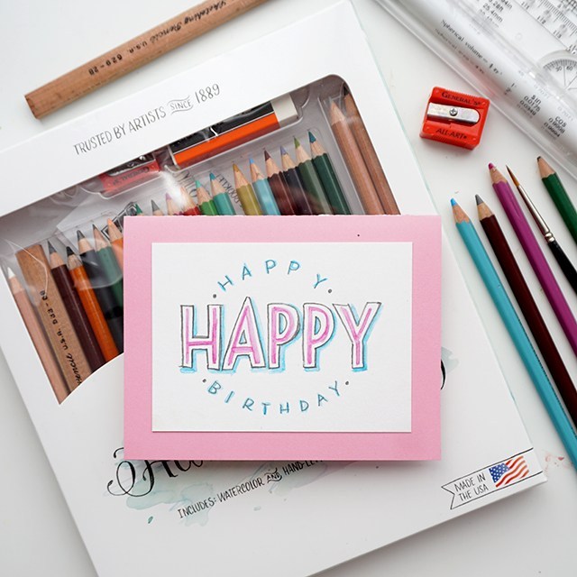
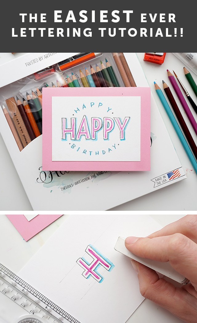
Now let’s talk hand-lettering!! Calligraphy and hand-lettering can be intimidating. Especially if you’re just starting out and teaching yourself. That’s where the humble, yet mighty pencil comes in. The pencil’s got your back. In fact, I have my online class students pull out the pencil before they touch any kind of pen or marker. The master penmen use pencils, so you can, too. I’m really excited to have shared this fun and simple technique on KSL’s Studio 5 on how to incorporate pencil lettering into your every day creativity. Let’s do this, shall we?!?
Isn’t this a fun card? You can totally make this in about 10 minutes.
The cool thing about pencil is that you can erase it until you commit. So watercolor pencils you can erase until you add water. You can erase most pencils quite effectively until you commit by pressing really hard or going overtop in pen. You can see the difference between committing with pressing hard with a dark pencil on the right and a marker on the left. The cool thing is you don’t have to have fancy materials in order to be successful with your pencil lettering. Here’s what you need:
Paper – use a mixed media paper if you’re using watercolor pencil.
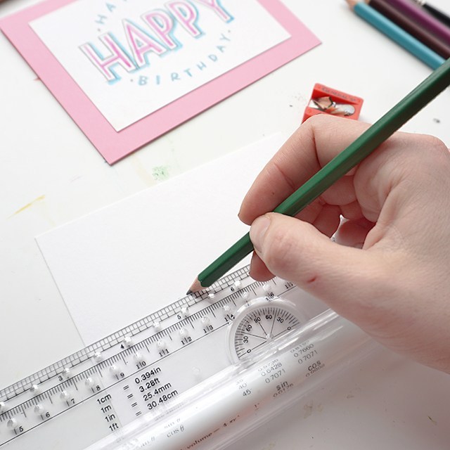
Ruler – you gotta draw light grid lines or your lettering will be all over the place. Clear grid rulers are my fave.
Pencils – I’ve teamed up with General Pencil to create a pencil lettering kit, try it! It’s great.
Brush – I like small round brushes for this, but any brush you have on hand could also work!
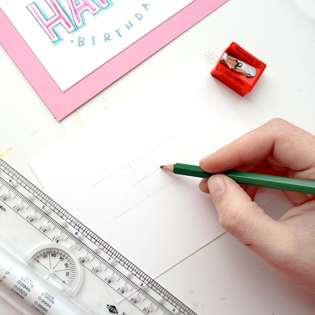
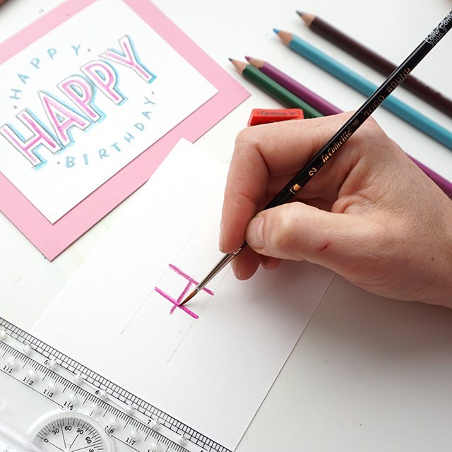
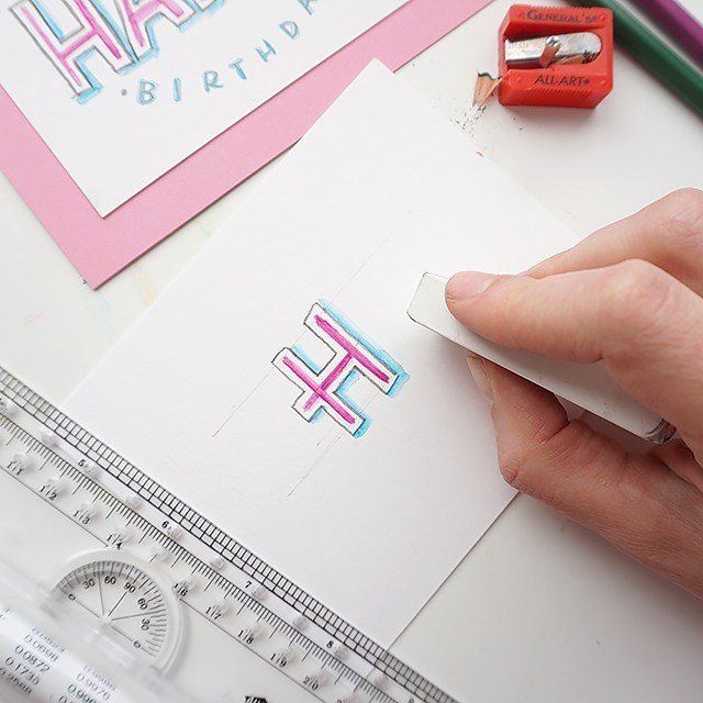
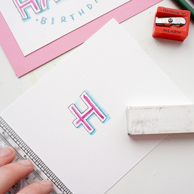
Step 1: Cut down your paper to size. I’ll leave it up to you as to what size you want to trim it down to. Get a ruler and mark out your top and bottom lines. The master penmen use a ruler to mark out guides, you should too.
Lightly draft out your message. I find that short words in this style work best. Also, when drafting out your letters, make sure they’re generously spaced apart. Because we’ll be outlining around each letter, you’ll want to make sure you give yourself enough room for those outlines.
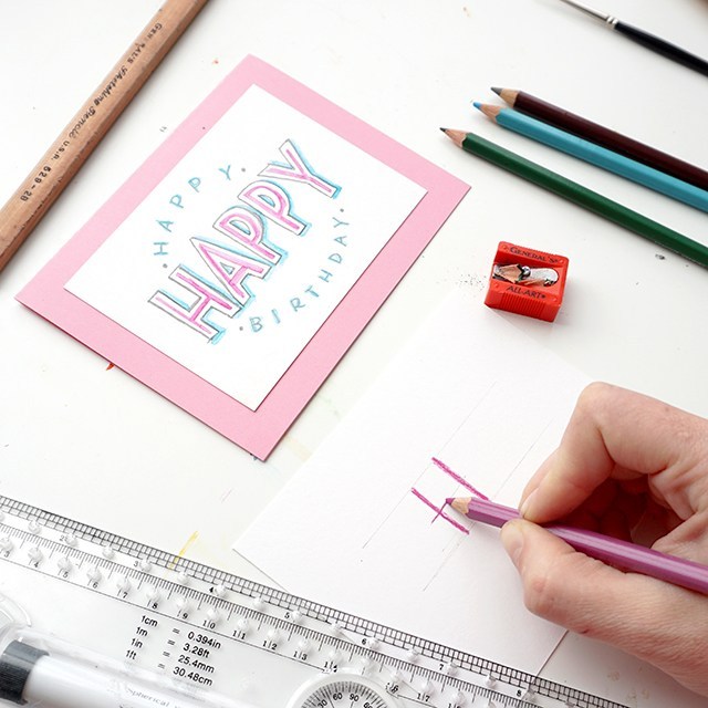
Grab a watercolor pencil and roughly mark out the outlines with watercolor pencils. For the sake of this style, pick two colors that you’d like to go together. Use the darker of the two colors for this part of the outline.
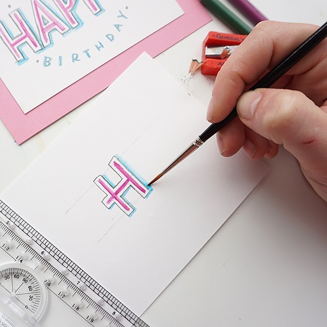
Wet a small round brush (this is a size 2 round) and smooth out the outline of your watercolor pencil.
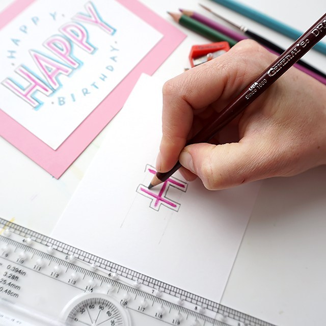
Leave a little bit of white space and outline each letter. I love the General’s draughting pencil for this. It’s hard enough to maintain a stable line, but it’s smooth and dark.
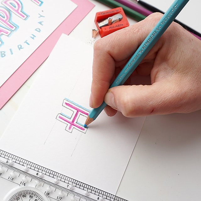
With your lighter color, outline the right-hand and bottom sides of your outline. You’ll use a light touch to lay down pigment to not disrupt the draughting pencil layer.
Using the same wet round brush, smooth out and soften the drop shadow you’ve created.
Once the watercolor is dry, erase away guidelines carefully. I like to use the corner of the eraser.
Bam! You’re done. You can send it as-is, or you can trace over the darker pencil marks in pen or marker to make the layout pop even more.
This tutorial is free for personal use. Affiliates are used to link to products I actually use and have. Your support here makes more content possible. Thank you!
Another YouTube video coming at you this week! It’s taken me forever to get this post out, the end of school stuff just took so much out of my week last week. So here we are posting late. If you want to stay up-to-date on new videos, subscribe over on YouTube! I’d love to see you over there. You can expect to see product reviews, art tutorials and time-lapse/real-time calligraphy work.
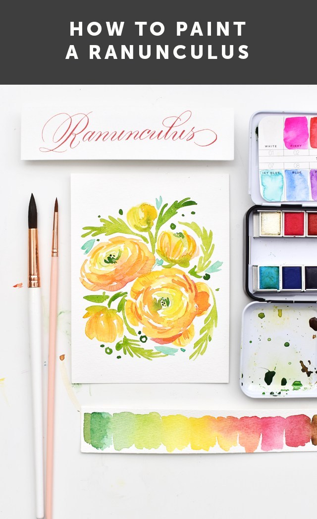
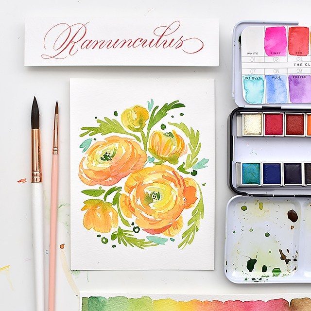
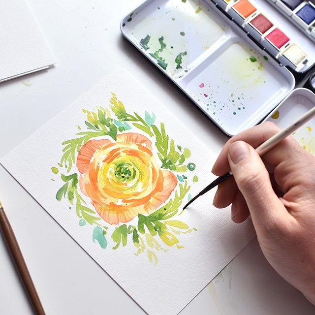
I’m giving you a peek into my process with my 100 days project (follow along here!). It’s a fun but crazy challenge to attack so many of these flowers. And ultimately I’ve come to grips with the fact that I won’t be able to finish them all in 100 days. I’m so far behind. But I’m determined to see this series through, no matter how long it takes!! Here’s what you’ll need (these are the exact materials I used):
HEY!! Use code Melissa15% at myprimaplace.com for 15% off your order. I tried the Prima Watercolor Confections for the first time with this flower set and I’m loving how the colors blend, lay down, dry and mix. They’re just lovely. And aren’t these little tins just the cutest things ever?!?
Here are the steps broken down. But I HIGHLY recommend watching the video. I give far more detail in the video. To do:
Start by using your largest brush and mix a light yellow green, bright yellow, and yellow orange. You’ll want all three colors mixed before you start.
Lay down brush marks in a circle with the light yellow green. As you make a larger circle (keep it uneven), start picking up the yellows, then as you get to the outside of the flower, move on to the yellow orange.
Allow the colors to melt into each other creating a subtle gradation from green to yellow to orange.
Let your flower dry fully
Next, use the size 6 brush and a darker version of your orange to create smaller concentric circles around, creating the shadows.
While you’re waiting for the flower to dry, add the foliage. Work and frame your flower by branching the foliage back into the flower.
Now get the liner brush with the same color, or just slightly darker (not by much) and add the details to the petals and darken up the concentric lines and the greenery in the middle.
Add any other decorative bits and you’re done!
Try changing up your perspective for a full bouquet of ranunculus! I hope you give this tutorial a try. I’d love to see your work if you do! Tag me (@melissapher) on Instagram or message me here if you end up trying this technique out!
This tutorial is free for personal use. Affiliate links are used to products I actually use and have. Your support here makes more content possible. Thank you!
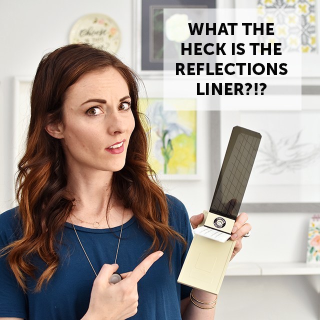
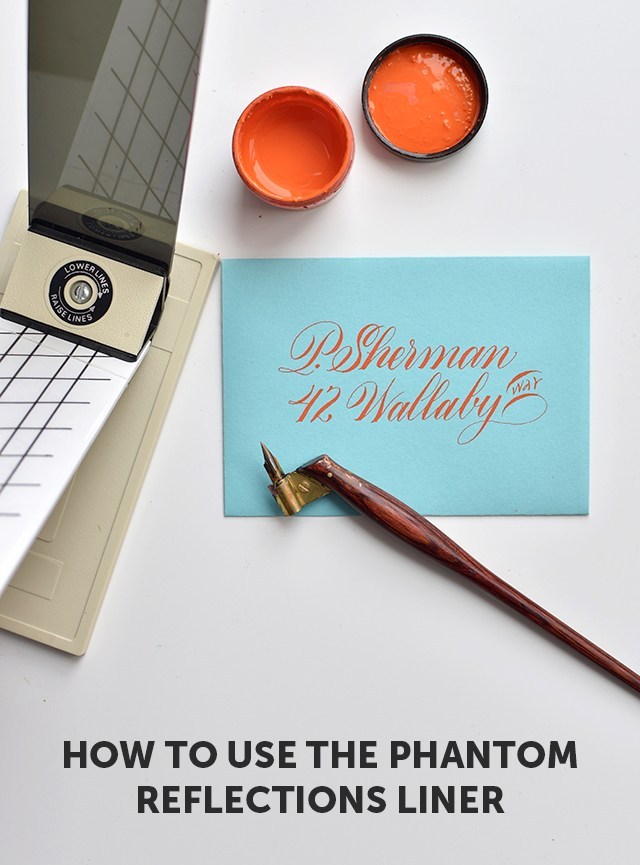
As requested by a couple of you fine folks who actually read this blog still (thanks, by the way!! ;)), I’m presenting a video with info on the Phantom Reflections Liner.
This thing is a bit tricky. If you don’t get it quite right, you’ll have just slightly wonky lines that will make your work look just barely off. We don’t want that, do we?!?
I mentioned it in my review of the laser square. I mention that the reflections liner is not that great. And it can be quite frustrating to use. But there definitely is a place for it.
The cons:
You need a well-lit area.
You have to look through the viewing glass at the right angle in order to really see the angles, so that changes your orientation some.
Looking through the dark viewing glass for hours can strain the eyes.
It can feel bulky to use.
The pros:
It’s old-school technology that doesn’t require batteries!
You can break it down for easy storage.
You can create guides of any shape, size or angle (for envelopes to full-blown pieces of art!)
It’s great for opaque or dark papers.
So without any further ado, check out the video explaining how to set up the phantom reflections liner:
It’s basically like an analog teleprompter to broadcast your guidelines onto your paper. Brilliant little piece of equipment, right? Check out the above video for the full break-down of how to set it up.
If you liked this video and others that I share here, consider giving my YouTube channel a subscribe! Check out my online pointed pen class (aka for learning “Modern Calligraphy”) over at calligraphy.org. I teach all sorts of things like how to understand the foundations, push your style so that it’s still readable and how to address envelopes. The class includes images, videos, text and one-on-one feedback from me & my co-instructor Erika. We help you troubleshoot, keep you motivated to continue through the coursework and answer any questions you may have. Feedback includes additional images and videos to help clarify and encourage.