Posts Tagged ‘blog tip’

Redesigned: Fantabulously Frugal

9 Comments

During Chris’s two and a half weeks of Christmas vacation, we spent our time redesigning a few blogs. We had a grand time working together & making the interwebs a tiny bit prettier. I’ll be sharing a finished project each week along with a design tip (or two) for a better blog.

It was my sincere pleasure to work on the site: Fantabulously Frugal. Lisa was a gem to work with!

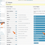
Before I got started the elements on the page had no heirarchy & the ads weren’t very organized. A lot of the work involved in this redesign was on Chris’s end of things, with reorganizing the sidebar so that it would read well on the page AND so that it could be easily editable on Lisa’s end of things.

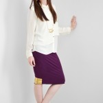
There were a few things I did like about her blog & incorporated in the redesign: unexpected color palette, stripes and handmade elements. Since her site is deal/ad-based, I felt like the handwritten details made it look more approachable, but then kept it professional looking. I made a very fine diagonal stripe for the background & softened her color palette to a charcoal/navy/purple color family. Doing this redesign was so satisfying; like organizing-my-closet-by color-with-all-matching-hangers satisfying.

What do you think? Head on over to Fantabulously Frugal for the full after (and for info on killer deals).

• Blog tip #3: DESIGN + ADS •

If you’re thinking about starting a blog with ads or you’re planning on adding advertisements to your current blog; you need to know standard ad sizes. We talked about this a little bit at Alt this past year. Large companies that are looking to advertise with Google or ad networks use standard sizes for their ad campaigns. Check out IAB for standard ad dimensions, file sizes & animation length. It’s a fabulous resource for bloggers & companies. See below for the most popular of the standard ad sizes:

  • Leaderboard: 728 x 90 pixels
  • Medium Rectangle: 300 x 250 pixels
  • Wide Skyscraper: 160 x 600 pixels

Black & White & Loved All Over Redesign

11 Comments

During Chris’s two and a half weeks of Christmas vacation, we spent our time redesigning a few blogs. WE had a grand time working together & making the interwebs a tiny bit prettier. I’ll be sharing a finished project each week along with a design tip (or two) for a better blog.

Ellen was an absolute dream to work with. She’s been commenting over here on ISLY for some time, so I was familiar with her adorable family-centered blog: Black & White & Loved All Over. When she signed up for her bloggy face lift, I was SO excited to do it for someone I was familiar with!

Her before (above) wasn’t terrible, but it lacked a lot of cohesion. The font she had chosen for her header wasn’t bad & I definitely appreciate that she used it only in the header. With that in mind, I hand-lettered her masthead & used organic elements to keep things cozy & familiar.

I didn’t want to do a literal translation of Black & White the color, so I leaned more towards grasping opposites and mostly in font weight. The color palette we kept slightly muted to create more warmth & I included a large profile picture to add a personal touch. As someone who reads a lot of personal & commercial blogs, I want to know what the writer looks like. I want to see his/her face so I can get a sense of who they are. I love the about picture of Ellen. I don’t know her in person, but I feel like her picture embodies someone approachable, creative & kind. Which I assume she is, since she was awesome to work with.

I’m totally in love with the vintage handkerchief teeshirt update pictured above. Ingenius! I’m a firm believer that clean & cohesive design elements will help make her already awesome projects shine. So on to the first design tip:

• Blog tip #1 : COLOR! •

Don’t be too literal with your color scheme, but not so over the place, either. Find an image that inspires your style & glean your palette from that. I head over to Color Collective frequently for a starting point for color palettes. Lauren is great at picking very inspiring images (she credits them all correctly, too). It’s a fantastic resource for cohesive, beautiful & unexpected color combinations.

mobile site