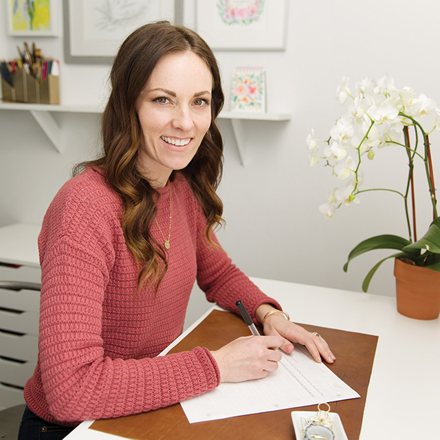
I came out with a book! This Penmanship book takes you through the progression from all-caps print, to cursive, to developing your style to brush lettering. It’s a modern penmanship approach that uses foundations of Romans, Italic, Business Penmanship and Engrosser’s Script. Sounds like a hodgepodge, but it totally makes sense. Click here to snag a copy!
Hello new friends from Studio 5! Check me out on Instagram to peek at all the fun stuff going on…
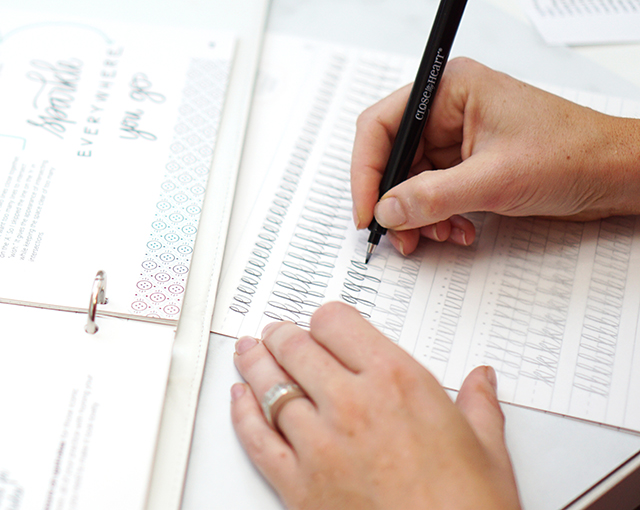
You can progress through the book in chronological order, or skip around as you see fit. The book is loose-leaf pages with a 3-hole punch so you can put it in any 3-ring binder and pull out pages for practice with tracing paper. We opted for this as opposed to a spiral bound book, because we wanted this to be approachable for both right-handed and left-handed beginners! The book is geared towards any beginner ages 10+. Ages 6-10 can work on it with grown up guidance.
So let’s talk about the 3 common mistakes that I see in beginners approaching penmanship AND brush lettering and how to fix it…
Mistake 1: Holding the pen wrong and too tightly
Hold the pen or marker (check out my line of brush markers right here!) in a traditional tripod grasp. Don’t let your thumb take over! And if you’re having a hard time with holding the pen too tightly, hold a pen or object in your non-writing hand as tightly as you can. Your grip in your writing hand will naturally ease up.
Mistake 2: Going too fast
99% of my beginner students write too quickly. I’m constantly saying slow down. Slowing down will give you better structural precision until muscle memory takes over, and it allows for better and more controlled transitions from thick to thin when doing brush lettering. GO SLOW. Then, GO SLOWER. Slow, purposeful practice is going to get you better, faster.
Mistake 3: Practicing willy nilly
Use those guide sheets!! I have multiple blank guide sheets and practice worksheets for each letter I teach in my book. Practicing with guides makes all the difference in bringing muscle memory into learning. With all 3 of these tips combined, you’ll be unstoppable!
Hope you enjoyed my segment on Studio5! Let me know if you have questions about my book. And if you’re the kinda person that needs to learn face-to-face… I’m teaching a beginning brush lettering workshop next week, September 19th. Click here to register. And as always, my online class is always open.
I’ve got a Modern Copperplate Calligraphy workshop coming at you in just a couple of short weeks! This workshop is far more intensive than the Pinners program workshops. The class time is 3+ hours (because we usually go over) and limited to 10 students.
A lot of you have been asking me about my workshops and how they work. We’ll be going through the upper and lowercase fundamentals of my modern script. My modern script has a slant to it, it’s airy, informal, yet elegant. Not only will you learn my style, but you’ll learn classical foundations along the way including, but not limited to: how to properly use, care for and hold the pen, the tools to use and the foundations of readability.
In the class I take time to demonstrate, then have you try your hand at it while I walk around. I give encouragement, feedback, physical adjustments as needed and answer any questions you may have. This class is great for beginners and “beginnermediate” calligraphers that may have had a self-taught start. No experience is necessary. Lefties are welcome too, I can teach both left- and right-handed, upside-down and backwards. ;)
Above: an example of a student’s practice at one of our workshops. Below: more student practice.
I hope to see you there! Don’t hesitate to reach out if you have any questions. If you’d like to get on the email list for local workshops, comment below with your email or message me at melissaATmelissaesplinDOTcom (the contact link above is broken :\ ).
Hopefully this helps as you explore calligraphy more. Let me help you even more on your path to making beautiful, readable calligraphy in your own distinctive style. My Modern Calligraphy workshop includes personal coaching to help you along every step of the way with your calligraphy journey and explorations. I have a brush lettering class too!
Explore handlettering with me at Utah Pinners on Nov 2 at 2:30. To use your promo code, click here and use code ESPLIN for 10% off through GrowTix when you purchase your tickets. Be sure to pre-purchase your kit for bonus goodies!
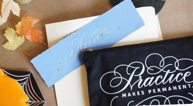
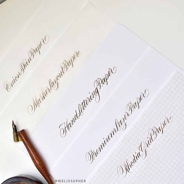
Not all paper is created equal. Chances are, if you’re just starting out, you may have found some issues with your practice. Or if you’re not a beginner you had issues when you were just starting out. And maybe you’d like to find some new papers to try out!
One of the most frequent questions I get asked is, “What paper do you use?”. That’s a loaded question. For now, let’s talk about practice papers. Read the full post below for all the nitty-gritty details for why I like these papers, or watch the video. :)
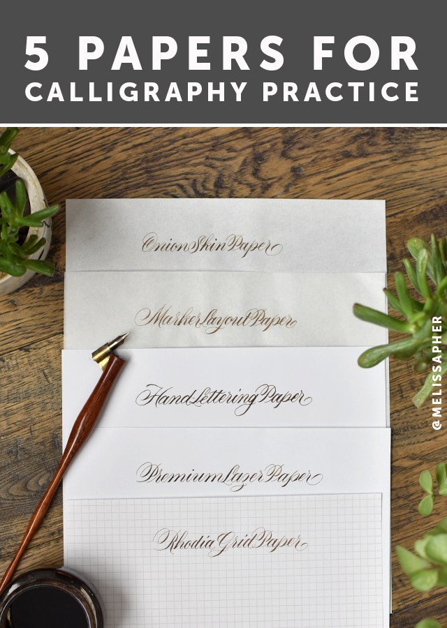
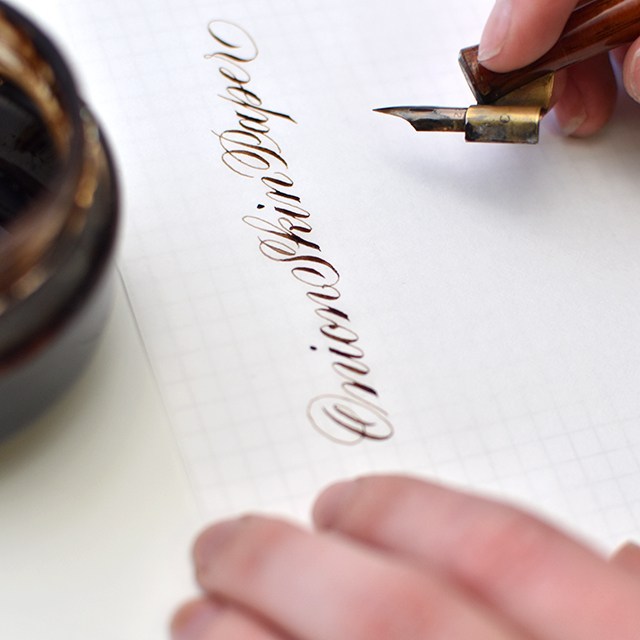
For the sake of this post, I’m using a Hunt 22 nib and Walnut ink on all papers so you can see how each paper handles ink. Also, never mind the fact that I can’t seem to spell the word “laser” correctly. I don’t know why I always get the ‘s’ and the ‘z’ mixed up with that one. The same papers that work with pointed pen also work with pointed brush. When looking for a good practice paper for both pointed pen/modern calligraphy and pointed brush/brush lettering, look for a smooth surface that allows the writing instrument to glide smoothly across the paper and a paper sturdy enough, or well-enough made that it holds ink without bleeding or feathering. These are my go-to calligraphy papers that I seem to always have on-hand.
I’m going to go through each paper from most transparent to most opaque and list out each paper’s pros & cons and links (affiliated*) to where to purchase:
PROS: This paper is very smooth and handles ink beautifully. It’s about as transparent as tracing paper, but without the drawbacks. It’s about $30 for an entire ream (500 sheets), which makes it a great value. You can easily slip guidelines under your paper as pictured above and remove them for scanning or photography.
CONS: There’s really only one brand and one place (the PaperMill Store) where it’s available (amazon is a LOT more expensive). It doesn’t go through the printer well (but no need with its transparency). I’ve noticed some friends complain it can be a bit too smooth.
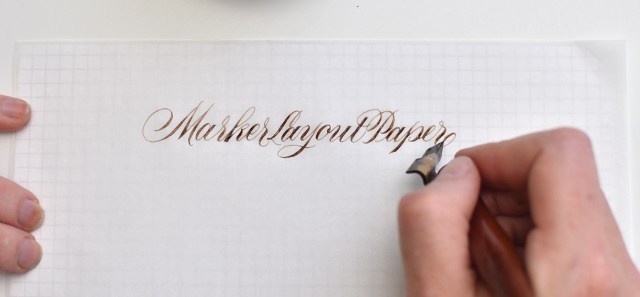
PROS: Marker Layout paper is easily accessible, you can purchase it from just about any craft supply store by the pad. It’s nice you can contain your practice within a pad, and it’s semi-transluscent so you can easily put guidelines underneath as pictured above. It’s okay for scanning, but has a little more tooth to the texture of the paper (that can be a pro or a con). Every marker layout paper brand I’ve tried (Canson, Borden & Riley, Strathmore, etc) has performed consistently. I find I prefer Canson out of this category.
CONS: At between $9-13 per pad with only 50-80 sheets per pad, this is more expensive than onion skin paper. It comes in 9×12 pads, so you have to cut them down smaller if you’re looking to print on them or to scan them in standard-sized scanners.
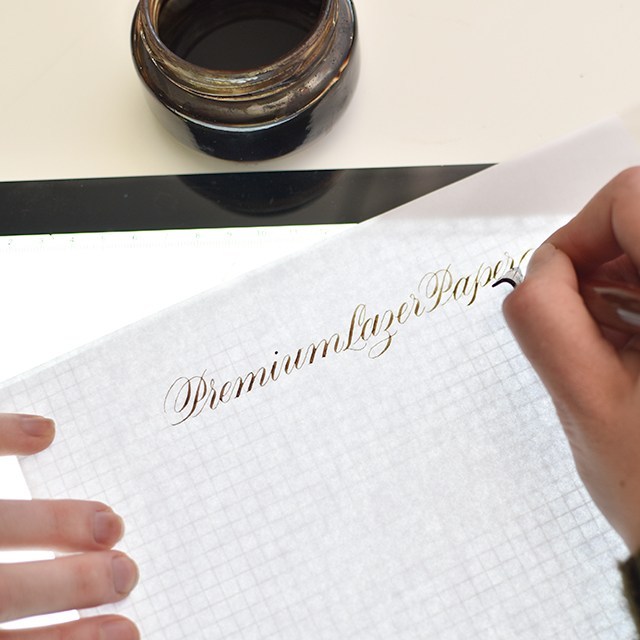
PROS: There are many brands of premium laser papers out there, so I keep this pretty generic. Many that I’ve tried have worked great with ink. HP Premium Laser Paper is the most popular of this bunch. I’ve had great luck with Hammermill as well. What to look for: 32lb, Laserjet compatable, premium paper. Regular copy paper will ruin your life. This is probably the most economical and easily sourced option of the lot. You can print guides directly onto this paper.
CONS: It’s more opaque, so you’ll need to use a lightpad or print directly onto your paper with a local or at-home printer. Depending upon the brand you’ve purchased, it may have a bit more of a tooth to it. No worries. Just make sure you’re practicing with a light touch (like you should be doing anyway).
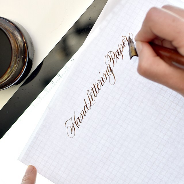
PROS: This paper is a hybrid paper. While it’s still considered a practice paper, the weight and quality of this paper could be used as a finished paper. It’s probably the thickest paper of the lot. It’s incredibly smooth, shows a nice bold line and the ink lays evenly on the paper. This paper handles more liquid media than the other papers of this type, so you can practice with wet ink, thicker downstrokes, experiment with watercolor effects without the paper buckling. This paper comes in larger sizes for larger work.
CONS: It’s a little harder to source this paper than the others, but it’s worth trying if you’re curious. It’s a thicker paper, requiring a lightpad or really dark guidelines to go underneath the paper. Or, worst case scenario, using a pencil to draw out your guidelines.
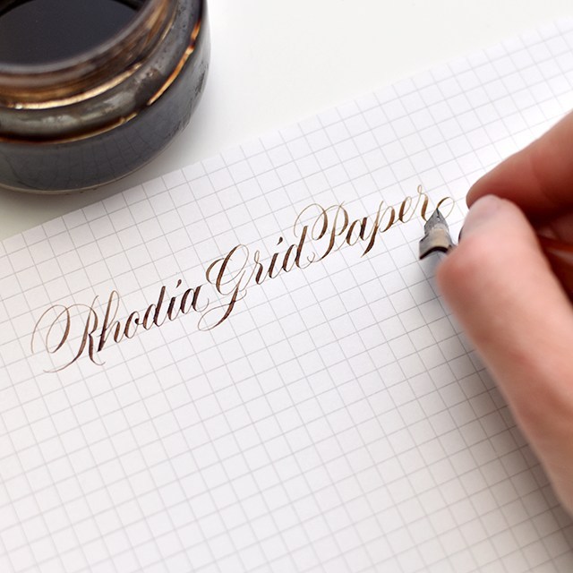
PROS: Rhodia graph paper already has gridlines on it!! You can find their dot pad, if grid lines are too much, but I really like the structure of the grid. This paper is beautifully smooth and handles ink like a pro. It’s got a little bit of texture to it, enough to give your pen feedback on where you are on the paper, but not so much that your nib is skipping all over the place. Grid lines are 5mm apart
The Engrosser’s Pad from John Neal is also great (make sure to purchase the one labeled “engrosser’s pad” if you’re doing pointed pen), it also includes 55º angle lines for keeping angle lines consistent. The grid markers are quite small at just over 3mm (1/8th inch), so it can be a little harder to keep track of the sizing if you’re going for a larger scale.
CONS: If you get the Rhodia ICE pad, the grids come in a light grey, which means you can’t scan out the grid lines if you’re digitizing your work. It’s a premium paper (from a French company, so regal ;)), so it comes at a premium price. Thankfully, with the rise of calligraphy and lettering in popularity, the pricing and availability for these pads has become more accessible. The regular orange Rhodia pads have a blue grid that can be photoshopped out, but it’s a little tricky.
Hopefully this helps as you explore calligraphy more. Let me help you even more on your path to making beautiful, readable calligraphy in your own distinctive style. My Modern Calligraphy workshop includes personal coaching to help you along every step of the way with your calligraphy journey and explorations. I have a brush lettering class too!
Thanks to Goulet Pen Company for providing us with the Pilot Parallel Pen Handlettering and Calligraphy Set. Both Hayley and I had a lot of fun playing around with these pens. I’ve had a few of these pens for a while, so it was fun to use the full line of pens from the Parallel Pen line.
Before giving you my thoughts on the Parallel Pens, I thought I would give you a little info about calligraphy in general: Broad-edge calligraphy vs. Pointed-pen calligraphy.
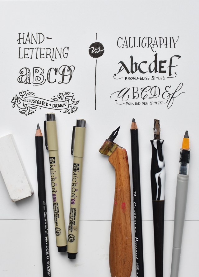
You’ve got hand-lettering versus calligraphy. Hand-lettering is illustrating letterforms. Often times letterforms take on a more dimensional look with decorative elements and illustrative affectations (above left). Calligraphy is the careful construction of letters with a prescribed set of strokes (see above right). Think of it as carefully writing each stroke, almost drawing each stroke.
There are two camps within calligraphy itself: broad-edge and pointed-pen. Broad edge materials literally have a broad edge (see marbled holder and pilot parallel pen in the far right). The orientation and angle of the nib gives you the control over thicks and thins. But because of the broad edge, you’ll find that you have lots of thick strokes (see broad-edge styles). The broad-edge styles in the above image there are in no way exhaustive of the kinds of letters you can make with those tools. As a general rule, tools with number measurements like Speedball C-2, C-0, Mitchell 5mm, Pilot Parallel 6.0mm, etc. are all describing the width of the edge.
Pointed-pen calligraphy, while using angle and orientation in order to work, relies on pressure in order for the thicks and thins to happen. As a result, you’ll find you can easily get sweeping fine lines and hairline flourishes with pointed-pen tools. When it comes to “Modern Calligraphy” that’s oh-so-popular, it’s referring to a pointed-pen script hand that’s based (although sometimes too loosely to be actually readable) on Copperplate/Engrosser’s Script foundations. This style needs pointed-pen tools. If you don’t, you’ll get messed up results like below:
SO……..
While the Pilot Parallel Pen Set may not be the right materials for “modern calligraphy”, this set is awesome for exploring a wide range of broad-edge styles in a variety of sizes! Without any further ado, check out the full review video. If you already know the difference, skip to 5:40.
Now for the review, we really loved these pens a lot! Here’s the breakdown of the pros and cons.
The pros:
Instruction packet for easy assembly
Variety of colored inks & black inks
Plastic nib/plate cleaner
Pens are juicy and synthesize dip pen beautifully
They travel well
They feel great
The cons:
The artwork on the packaging is a little deceptive (you canNOT do brush lettering with these pens)
The “ductus” pages are made from fonts, not calligraphic hands*
You can’t put the caps on the ends of the pens while in use
*A “font” is a programmed set of letters used on the computer, a “hand” is a calligraphic style. The fonts in the ductus pages aren’t a bad place to start, but they don’t give you much information on pen angle/orientation or pen manipulation or stroke order.
Overall, I’d say this set is a win. If you’re interested in trying broad-edge or bolder styles these pens are a must-have! They’re a great tool to take with you for practice on the go or even when attending workshops, meet-ups or guild meetings with limited space.
Want to learn more about calligraphy? Check out my classes over at Calligraphy.org!
Product provided by Goulet Pens. All thoughts are our own.
Sometimes I feel so lonely in a world of Monday-haters. I LOVE Mondays! It’s a fresh week. I get so much done. My motivation is fresh. My ideas are fresh. I’m refreshed from a day of rest. They’re the best.
I did this little real-time calligraphy showing you the stylistic differences between one nib and another. It’s HUGE, right? I didn’t change anything about my style, grip, materials; just the nib. Think about that the next time you’re in a calligraphy rut. If you’re still in a rut after that? Try taking one of my classes!! I’ve been teaching for 8 years, I’m encouraging, thorough and helpful. If you’re in the Utah area, check out April’s local workshops below! If you’re not, the online class is the next best thing with one-on-one feedback and encouragement in each class. Check it out here.
Learn the foundations of pointed pen and how to apply your own modern personality to your letters in this 3 hour intensive! It’s perfect for beginners or if you’re looking to brush up on your skills. Seats are very limited so we have a small, intimate group. You’ll get lots of one-on-one attention and feedback as we go through the lowercase letters and forming words together. Time allowing, we’ll work through numbers and capitals. I’ll give you the skills necessary to take your practice home with confidence. Materials and snacks included.
I’ve teamed up with Natalie Malan & Cents of Style for this day-long retreat! We’ll be covering flourished brush lettering and watercolor florals! The florals will be gorgeous, vibrant loose and modern (like we are all obsessing over these days). And the calligraphy will be with waterproof brushes so that we can create dynamic pieces with our watercolors. Workshop includes lunch, materials and snacks.