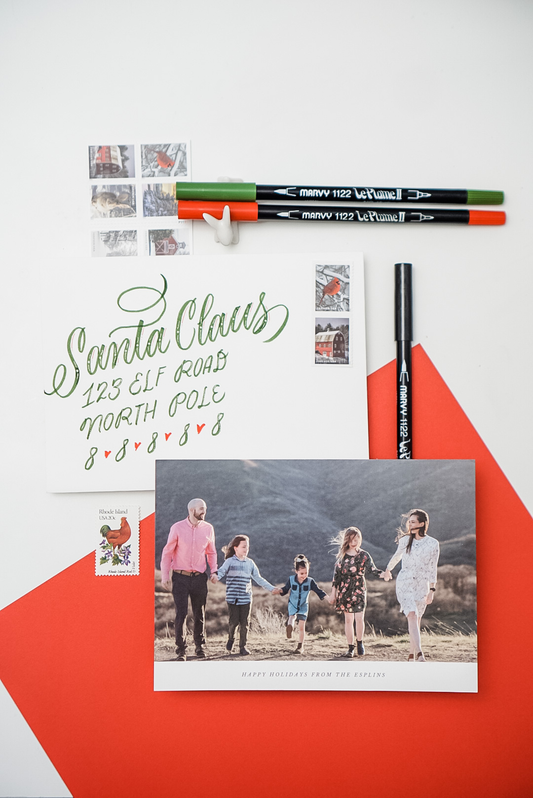
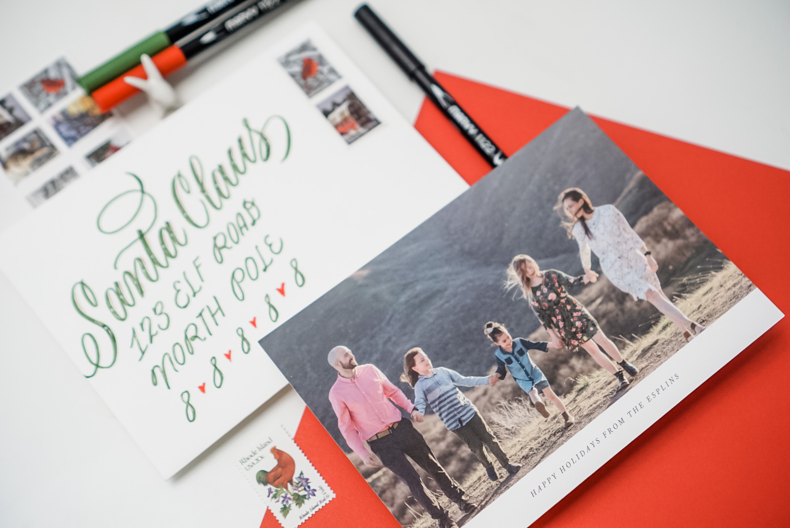
It’s that time of year that I personally look forward to: sending and receiving letters in the mail. This year is even more important because of so many family and friends we haven’t been able to see this year.
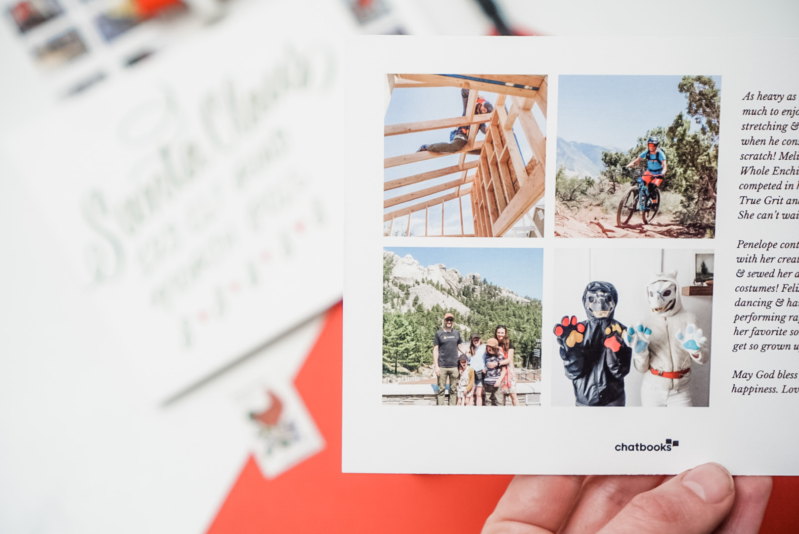
I’ve teamed up with Chatbooks to give you 20% off your order (cards, photobooks, prints, etc!) with code CBMELISSAE20! Use that code at checkout for 20% off. This is the second year I’ve gone with Chatbooks as my holiday card printer. They don’t offer custom design printing, but they do offer timeless designs that make it a no-brainer to use.
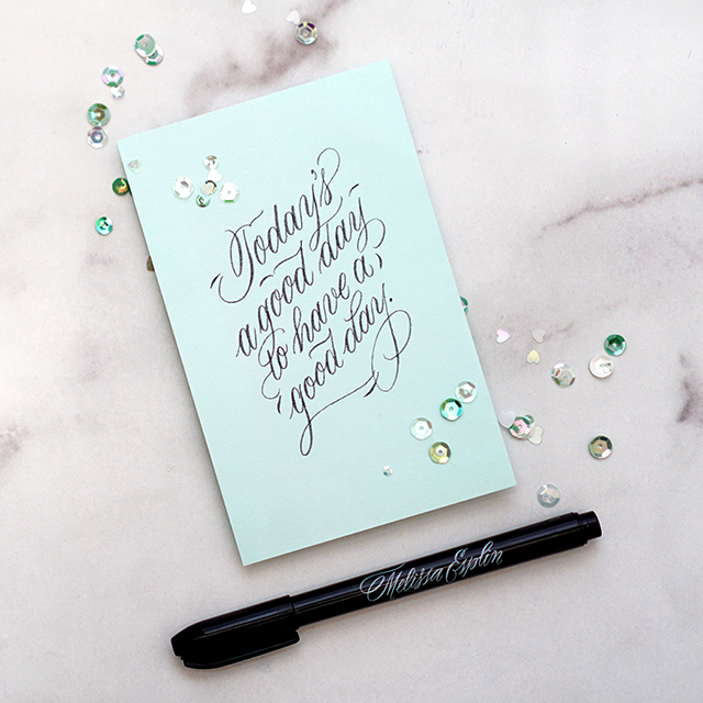
For me personally, Designing the card is something I CAN and could do really well, BUT it takes so much time. I’d much rather spend that time on addressing my envelopes beautifully. If you’d like to learn more about brush lettering and calligraphy in general, check out my online calligraphy classes! I teach online and give you one-on-one coaching to help you as you go along. Check out my Brush Lettering class if you want to try your hand at the style below.
Regardless of your lettering proficiency, check out the envelope templates below. Simply cut out the template, place overtop the envelope and write in the designated spaces. This template is for A7 envelopes and leaves you enough room for postage on the right-hand side. :)
Use brightly colored markers like these Marvy Uchida Le Plume II markers to give a spot of color as well! Use code PIN2020 for 25% off and free shipping over $25.
Hope you all have the happiest holidays and if you want to send me a card, message me on Instagram for my address. I’ll send you a card in return!!
I came out with a book! This Penmanship book takes you through the progression from all-caps print, to cursive, to developing your style to brush lettering. It’s a modern penmanship approach that uses foundations of Romans, Italic, Business Penmanship and Engrosser’s Script. Sounds like a hodgepodge, but it totally makes sense. Click here to snag a copy!
Hello new friends from Studio 5! Check me out on Instagram to peek at all the fun stuff going on…
You can progress through the book in chronological order, or skip around as you see fit. The book is loose-leaf pages with a 3-hole punch so you can put it in any 3-ring binder and pull out pages for practice with tracing paper. We opted for this as opposed to a spiral bound book, because we wanted this to be approachable for both right-handed and left-handed beginners! The book is geared towards any beginner ages 10+. Ages 6-10 can work on it with grown up guidance.
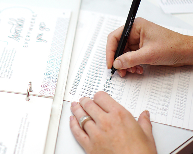
So let’s talk about the 3 common mistakes that I see in beginners approaching penmanship AND brush lettering and how to fix it…
Mistake 1: Holding the pen wrong and too tightly
Hold the pen or marker (check out my line of brush markers right here!) in a traditional tripod grasp. Don’t let your thumb take over! And if you’re having a hard time with holding the pen too tightly, hold a pen or object in your non-writing hand as tightly as you can. Your grip in your writing hand will naturally ease up.
Mistake 2: Going too fast
99% of my beginner students write too quickly. I’m constantly saying slow down. Slowing down will give you better structural precision until muscle memory takes over, and it allows for better and more controlled transitions from thick to thin when doing brush lettering. GO SLOW. Then, GO SLOWER. Slow, purposeful practice is going to get you better, faster.
Mistake 3: Practicing willy nilly
Use those guide sheets!! I have multiple blank guide sheets and practice worksheets for each letter I teach in my book. Practicing with guides makes all the difference in bringing muscle memory into learning. With all 3 of these tips combined, you’ll be unstoppable!
Hope you enjoyed my segment on Studio5! Let me know if you have questions about my book. And if you’re the kinda person that needs to learn face-to-face… I’m teaching a beginning brush lettering workshop next week, September 19th. Click here to register. And as always, my online class is always open.
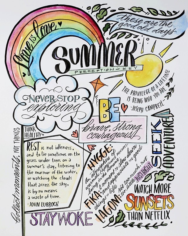
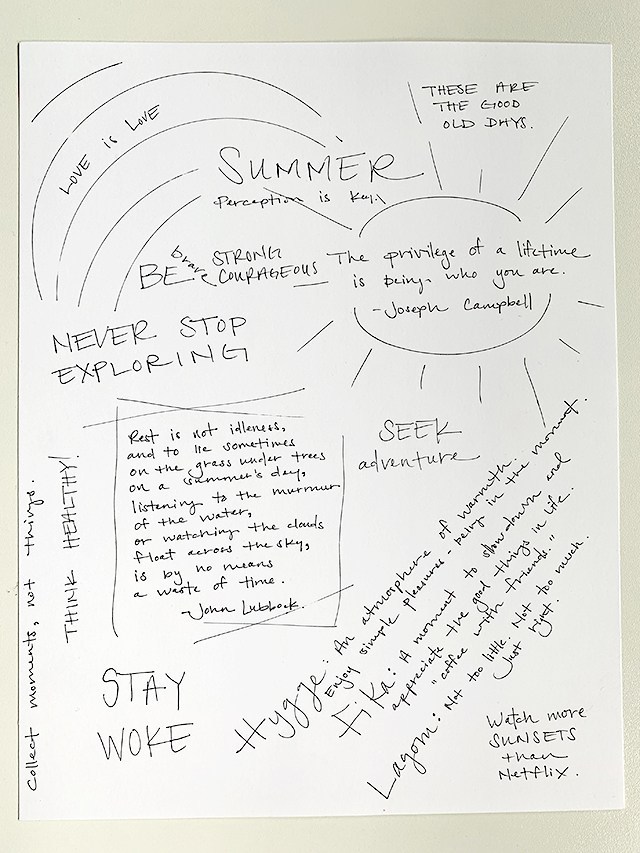
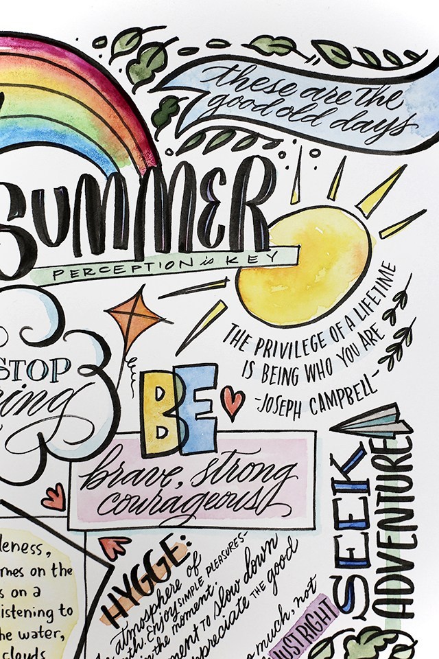
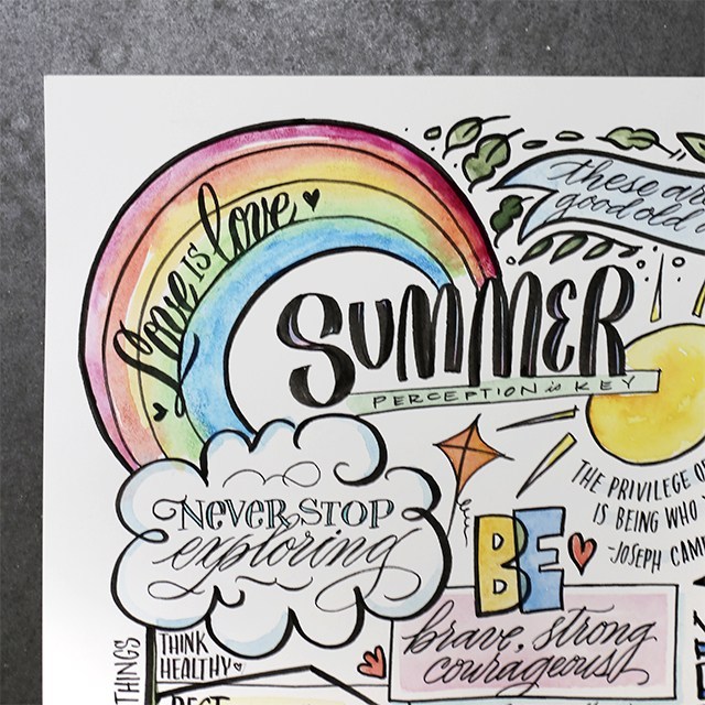
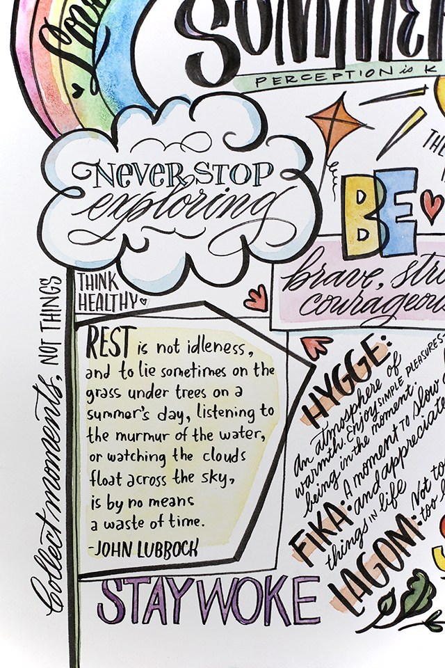
I love the idea of summer bucket lists, but our household is learning first-hand how overwhelming the summer over-scheduling can be. It’s intense. I was asked to make this summer “vision board” so-to-speak for Jane Rhodes and her family, and I really like her approach to summer. It’s less of a “we HAVE to get these things done” mentality and more of a, “let’s fill our lives with things that make us fill THIS WAY” vibe. I could learn a thing or two about that.
Jane and her family are passionate about adventure, quality time and LGBTQ+ rights. Each item on their vision board circles back to one or more of their core family values. It makes me think, what would I put on my own family’s vision board?
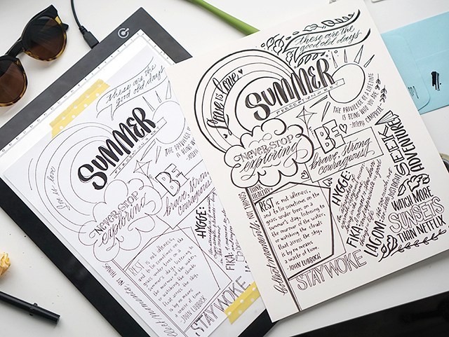
When Jane asked me about doing this for her, she sent me this mock up with each of the items she wanted on her vision board and I just took it from there. See below for more of the process:
I mocked everything up on my iPad (quite loosely) and then used my light pad and the mock up as scale and spacing reference to copy it onto the paper. Materials used:
Local workshop alert! I’ve had this workshop live, just haven’t shared it with anyone yet. Oops! Join me for an awesome modern calligraphy workshop! I’ll share with you all my secrets. ;) Maybe not all of them, but all of the calligraphy-related ones.
This workshop is a 3-hour event where we cover the basics of modern pointed pen calligraphy and any extras we can get to in the time allotted. I try to keep things going quickly, but not so fast that beginners get lost. I want to pack in as much information in such a short period of time!
Class fee is $99. It includes all materials, snacks, handouts and instructions. All you have to do is show up. Workshop will be in Draper, Utah (we are subject to a last-minute change, but it’ll be within 15 minutes of Draper area). Feel free to email me melissaATmelissaesplinDOTcom or comment below if you have any questions about the class. Hope to see you there!
Hopefully this helps as you explore calligraphy more. Let me help you even more on your path to making beautiful, readable calligraphy in your own distinctive style. My Modern Calligraphy workshop includes personal coaching to help you along every step of the way with your calligraphy journey and explorations. I have a brush lettering class too!
Explore handlettering with me at Utah Pinners on Nov 2 at 2:30. To use your promo code, click here and use code ESPLIN for 10% off through GrowTix when you purchase your tickets. Be sure to pre-purchase your kit for bonus goodies!
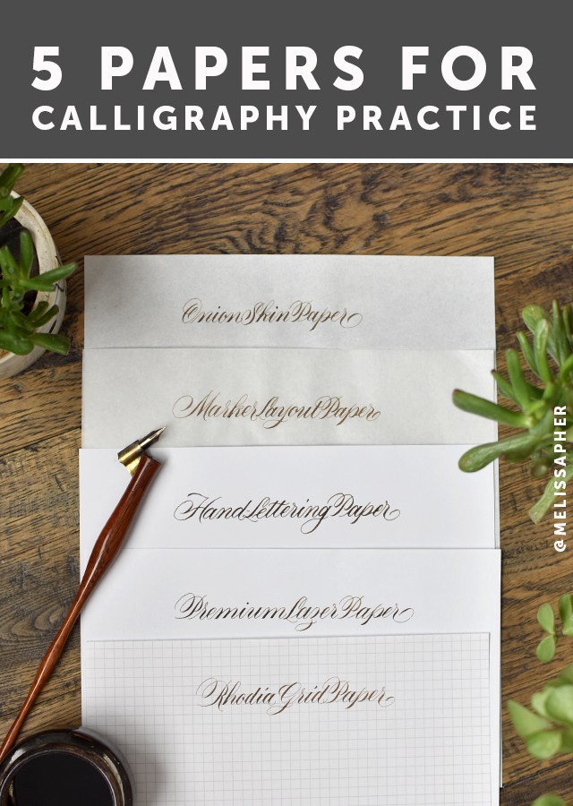
Not all paper is created equal. Chances are, if you’re just starting out, you may have found some issues with your practice. Or if you’re not a beginner you had issues when you were just starting out. And maybe you’d like to find some new papers to try out!
One of the most frequent questions I get asked is, “What paper do you use?”. That’s a loaded question. For now, let’s talk about practice papers. Read the full post below for all the nitty-gritty details for why I like these papers, or watch the video. :)
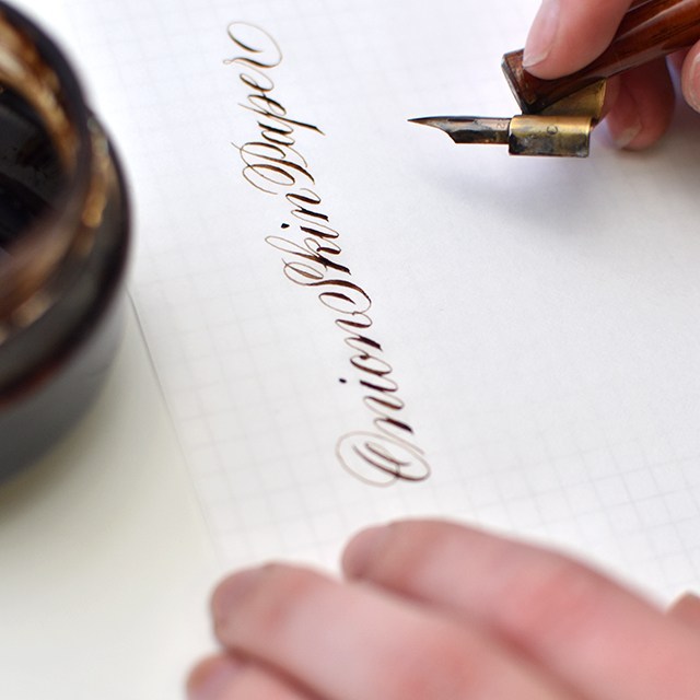
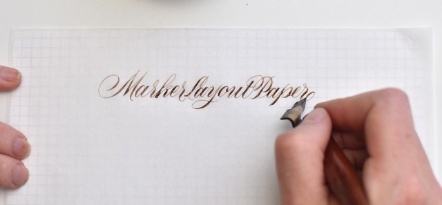
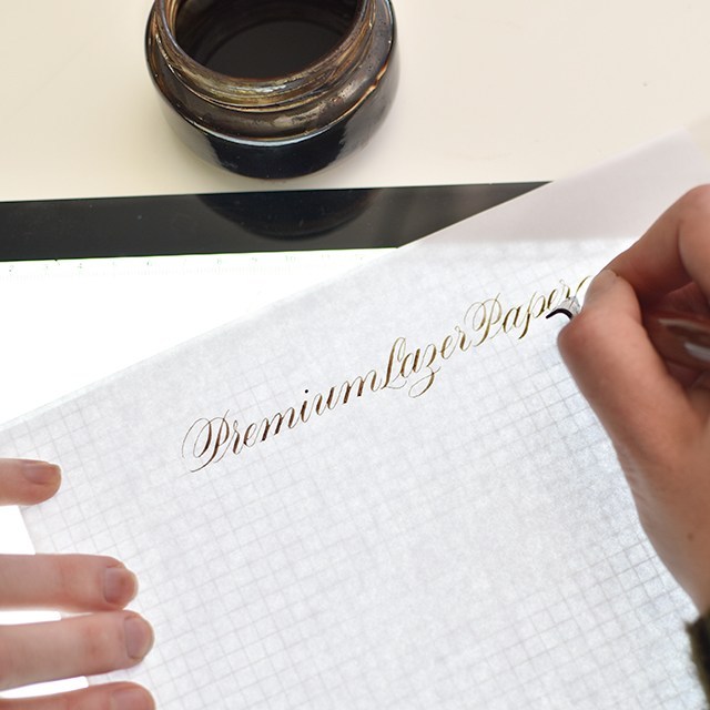
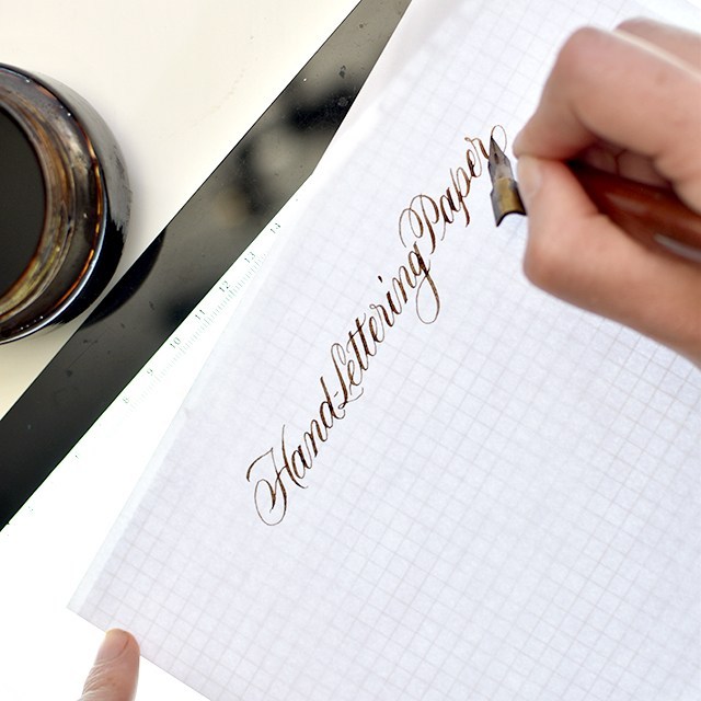
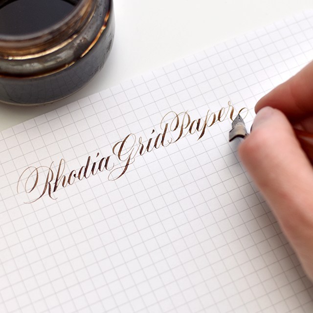
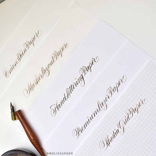
For the sake of this post, I’m using a Hunt 22 nib and Walnut ink on all papers so you can see how each paper handles ink. Also, never mind the fact that I can’t seem to spell the word “laser” correctly. I don’t know why I always get the ‘s’ and the ‘z’ mixed up with that one. The same papers that work with pointed pen also work with pointed brush. When looking for a good practice paper for both pointed pen/modern calligraphy and pointed brush/brush lettering, look for a smooth surface that allows the writing instrument to glide smoothly across the paper and a paper sturdy enough, or well-enough made that it holds ink without bleeding or feathering. These are my go-to calligraphy papers that I seem to always have on-hand.
I’m going to go through each paper from most transparent to most opaque and list out each paper’s pros & cons and links (affiliated*) to where to purchase:
PROS: This paper is very smooth and handles ink beautifully. It’s about as transparent as tracing paper, but without the drawbacks. It’s about $30 for an entire ream (500 sheets), which makes it a great value. You can easily slip guidelines under your paper as pictured above and remove them for scanning or photography.
CONS: There’s really only one brand and one place (the PaperMill Store) where it’s available (amazon is a LOT more expensive). It doesn’t go through the printer well (but no need with its transparency). I’ve noticed some friends complain it can be a bit too smooth.
PROS: Marker Layout paper is easily accessible, you can purchase it from just about any craft supply store by the pad. It’s nice you can contain your practice within a pad, and it’s semi-transluscent so you can easily put guidelines underneath as pictured above. It’s okay for scanning, but has a little more tooth to the texture of the paper (that can be a pro or a con). Every marker layout paper brand I’ve tried (Canson, Borden & Riley, Strathmore, etc) has performed consistently. I find I prefer Canson out of this category.
CONS: At between $9-13 per pad with only 50-80 sheets per pad, this is more expensive than onion skin paper. It comes in 9×12 pads, so you have to cut them down smaller if you’re looking to print on them or to scan them in standard-sized scanners.
PROS: There are many brands of premium laser papers out there, so I keep this pretty generic. Many that I’ve tried have worked great with ink. HP Premium Laser Paper is the most popular of this bunch. I’ve had great luck with Hammermill as well. What to look for: 32lb, Laserjet compatable, premium paper. Regular copy paper will ruin your life. This is probably the most economical and easily sourced option of the lot. You can print guides directly onto this paper.
CONS: It’s more opaque, so you’ll need to use a lightpad or print directly onto your paper with a local or at-home printer. Depending upon the brand you’ve purchased, it may have a bit more of a tooth to it. No worries. Just make sure you’re practicing with a light touch (like you should be doing anyway).
PROS: This paper is a hybrid paper. While it’s still considered a practice paper, the weight and quality of this paper could be used as a finished paper. It’s probably the thickest paper of the lot. It’s incredibly smooth, shows a nice bold line and the ink lays evenly on the paper. This paper handles more liquid media than the other papers of this type, so you can practice with wet ink, thicker downstrokes, experiment with watercolor effects without the paper buckling. This paper comes in larger sizes for larger work.
CONS: It’s a little harder to source this paper than the others, but it’s worth trying if you’re curious. It’s a thicker paper, requiring a lightpad or really dark guidelines to go underneath the paper. Or, worst case scenario, using a pencil to draw out your guidelines.
PROS: Rhodia graph paper already has gridlines on it!! You can find their dot pad, if grid lines are too much, but I really like the structure of the grid. This paper is beautifully smooth and handles ink like a pro. It’s got a little bit of texture to it, enough to give your pen feedback on where you are on the paper, but not so much that your nib is skipping all over the place. Grid lines are 5mm apart
The Engrosser’s Pad from John Neal is also great (make sure to purchase the one labeled “engrosser’s pad” if you’re doing pointed pen), it also includes 55º angle lines for keeping angle lines consistent. The grid markers are quite small at just over 3mm (1/8th inch), so it can be a little harder to keep track of the sizing if you’re going for a larger scale.
CONS: If you get the Rhodia ICE pad, the grids come in a light grey, which means you can’t scan out the grid lines if you’re digitizing your work. It’s a premium paper (from a French company, so regal ;)), so it comes at a premium price. Thankfully, with the rise of calligraphy and lettering in popularity, the pricing and availability for these pads has become more accessible. The regular orange Rhodia pads have a blue grid that can be photoshopped out, but it’s a little tricky.
Hopefully this helps as you explore calligraphy more. Let me help you even more on your path to making beautiful, readable calligraphy in your own distinctive style. My Modern Calligraphy workshop includes personal coaching to help you along every step of the way with your calligraphy journey and explorations. I have a brush lettering class too!