Posts Tagged ‘wedding invitations’

John & Anna Wedding | Watercolor Wash DIY

0 Comments

I had the joy to design and letter the wedding invitations for one of my cousins this last August. They were dream clients, too. Both have amazing taste and trusted my expertise and let me play with some fun, new techniques. 


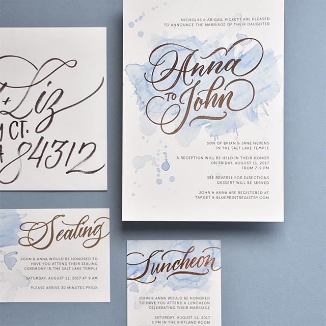
I’ve really enjoyed playing around with watercolor pencils and the playfulness and depth they provide to a simple watercolor wash, so I mixed a few colors to get their wedding colors in the wash and went to town. See the below video for an in-depth explanation of how to get that wash. I love the energy that explodes from the background with those washes. 

Check out the tutorial below and subscribe to my YouTube channel for more tutorials like this in the future! 

We went with copper foil printing for the names on the invitation. Part of me wanted to do copper foil for all of the text, but I didn’t want readability to be an issue. We did digital printing with digital foil through a wholesale printer I have an account with, so it was quite affordable, too!

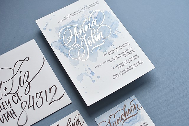
Man, foil is so hard to capture with a camera! It has a lovely rosy, rusty tone to it, it’s hard to see that in the images. But it popped nicely against the watercolor background. 

For the design, I used my go-to font Museo Sans and my own hand-lettering. I lettered the names and titles of cards with my iPad Pro using Procreate and Brush #4 from Fabian Fischer’s ultimate calligraphy brush set. I really liked the texture and functionality of that brush more than any other brush I’ve found around. If you’ve found other good ones, let me know!  

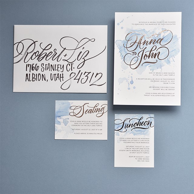
I ended up addressing all of the envelopes for the invitations as well. The couple gave me 100% creative freedom to pen them however worked best. I ended up doing a large-scale script for the names with an all caps for the address. I used the Cocoiro Brush Type marker (if you’re purchasing one for the first time, don’t forget to get a pen body to go with it). The markers lasted me about 75 invitations before it ran out of ink. I ended up doing between 500-600 envelopes. It was a project for sure, but I was THRILLED with the end result. 

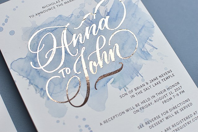
I’ve recreated the invitations using my ink-jet printer and laser printer and foil laminator so you can see some of the spots where the foil didn’t adhere. All details have been changed for privacy purposes.

Winter Wedding Invitations

0 Comments

I had the joy to design invitations for a friend of mine and her now husband. When I asked her what she wanted, she basically said, she wanted reds and winter greens. She left me to figure out the rest. I love getting let loose on designs. It’s fun. :) 

I lettered the names and painted the foliage, then scanned and designed. I didn’t have a whole lot of time to budget for these invitations so I kept them simple. I wanted something a little more visually impactful than center-justified text, so I designed the text on a slant. 

If I had had more time, I think I would have refined things just a little bit more, but I’m happy with the end result. Happy enough to post them here, right? ;)

I enjoyed adding more dimension to the art by including watercolor details to the artwork. I used techniques from a watercolor class I took from Natalie Malan in the fall. We’re going to be team-teaching a workshop! Learn calligraphy and watercolor on March 4th! Register here. Looking for more workshops? See the 2017 schedule for updates. 

Calligraphy: Handmade Wedding Invitations

0 Comments

Check it out! I made it on Oh So Beautiful Paper!

Stretching my limitations and challenging my capacity is one way to describe this wedding suite. I usually calligraph and PRINT wedding invitations. This one was all hand calligraphed.

melissaesplin-hand-written-original-wedding-invitation-1

About the bride: Lynsey is an UBER classy girl from our neighborhood. Her and her sister run Alder & Tweed an interior design firm based out of Park City, Utah. And when I say classy, I mean basically every outfit is sartorial street-style straight out of Manhattan.

melissaesplin-hand-written-original-wedding-invitation-2

She’s my dream client. However, I only had 14 days to complete the invitations before the wedding. This means I had about 2-4 days tops to complete invitations and envelopes so guests could get their invitations! Most of the invitations were delivered by hand, so mailing wasn’t too much of an issue. There were a couple of invitations that were mailed outside of Utah, which made me nervous, but because it was such an intimate event every guest had the date saved.

melissaesplin-hand-written-original-wedding-invitation-5

The invitations themselves were classic. I worked on flourishing the names and did a slightly flourished running script for the main text. I hesitate to call this real Spencerian, because it’s fairly casual and doesn’t have the classic Spencerian shades. I opted out of that for the text because of the paper. The felt-finish paper caused some issues with keeping fine, smooth hairlines. Overall, I feel like it worked because of the rustic venue for the event.

For the finest hairlines, I used a Nikko G nib (it works best on those rough papers) and Old World iron gall ink. The Iron Gall ate about 3 of my nibs through the course of the 30 invitations and envelopes, but it was worth it.

melissaesplin-hand-written-original-wedding-invitation-3

melissaesplin-hand-written-original-wedding-invitation-4

melissaesplin-hand-written-original-wedding-invitation-6

The lightbox was my BFF for this project. I created the design on layout paper, drew in the text with a dark micron pen and taped it onto the light box. I used light adhesive washi tape to tape each paper in place while I lettered. It took about 8 1/2 minutes for me to write out each invitation.

melissaesplin-hand-written-original-wedding-invitation-7

The bride and family were over-the-moon to see their names ornately flourished. I really had fun with the addresses. I got in a groove and just flourished these names to bits!

melissaesplin-hand-written-original-wedding-invitation-8

The wedding was stunning. See snippets here and here. And here.

Want to learn calligraphy? Take my online class! Learn with videos, images, text and personal coaching (like real comments from real professionals). Purchase the pointed pen kit right here.

learn-calligraphy-pen

Design: Emily and Taylor Wedding

0 Comments

My sister got remarried! I’m so excited for her. As a gift to them, I designed their wedding invitations. She was the easiest to please bride I’ve ever worked with. All she wanted was something casual, but nice. I decided to go with some brush work with the design.

melissaesplin-emily-and-taylor-wedding-watercolor-invitation-calligraphy-1

I used a more formal brush hand, but kept it in the casual zone by varying the letter sizing just a touch and pairing it with a simple sans serif. My favorite sans serif at the moment: Museo Sans 300. I swear I use this for everything. It’s like the denim jeans of fonts for me. It’s more round than Helvetica Neue, so a tad more casual, but so classic.

I created and scanned in a teal watercolor wash. I used Daniel Smith Cobalt Teal Blue and Daniel Smith Phalo Turquoise for the gorgeous colored washes. They’re incredible watercolors!

melissaesplin-emily-and-taylor-wedding-watercolor-invitation-calligraphy-2

Em wanted them really simple, but I felt like they were too plain as-is. Since she was only doing a few dozen, I bought some white vellum and cut out overlays with a heart goign around their names. It’s really hard to photograph, but if you look closely you can see.

I didn’t cut them by hand. I used the design as a reference to create the heart-shaped overlay in Illustrator then I cut using my Silhouette.

melissaesplin-emily-and-taylor-wedding-watercolor-invitation-calligraphy-3

melissaesplin-emily-and-taylor-wedding-watercolor-invitation-calligraphy-4

I bought teal envelopes to coordinate with the watercolor washes and addressed the envelopes in a more formal brush for the names and a casual print for the addresses.

saltybooth-tay-and-em

Pic c/o SaltyBooth

I love how this mini wedding suite turned out, but most of all I’m glad to see my sister found a great guy.


Calligraphy: Whitney’s Wedding Invitations

7 Comments

Unique wedding invitations are just about the best possible gift I feel I can give to a family member about to get married. It’s not something that I like to do for clients that often, but I love designing them for family members.

istillloveyou-melissaesplin-calligraphy-whitney-wedding-invitations-1

I guess you could say it’s another hobby of mine, even though it’s very much related to my business of teaching calligraphy to others. I love it so much.

istillloveyou-melissaesplin-calligraphy-whitney-wedding-invitations-2

My cousin Whitney is a very classic girl with a modern twist. I knew she and her mom would have very timeless decor at the wedding with simple elegance, so I conveyed that in a nearly all-calligraphed invitation.

istillloveyou-melissaesplin-calligraphy-whitney-wedding-invitations-3

The twist? Printing the names instead of lettering them. It sounds like a gimmick when I write it out like this, but it helps break up the blocks of calligraphy without making the invitation appear busy.

istillloveyou-melissaesplin-calligraphy-whitney-wedding-invitations-4

The ceremony invitations were done mostly in text with special little flourishes here and there.

It’s hard to tell from the photos, but the invitation paper is off-white and the printed text is a dark olive green. A slight variation on the traditional black and white invitation.

istillloveyou-melissaesplin-calligraphy-whitney-wedding-invitations-5

I didn’t know a whole lot about how the reception was going to go, but it turns out the invitations set the tone for the celebration perfectly. The venue was an old 1800s meeting hall with cream walls, white 10″+ moulding, original hardwood floors and stone masonry construction. The party was decorated wall to wall with garlands of doilies and large center-pieces of baby’s breath. Simple, yet oh-so-elegant.

mobile site