Posts Tagged ‘lettering’

Freebie: Inspirations + Crutches

3 Comments

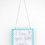
Yesterday I mentioned that everything is the new ruffle while talking about the fringe necklace DIY. Internet friend and fellow blogger Kristin begged for me to write it out in calligraphy.

I don’t normally do this sort of thing but the timing was perfect; I had wanted to experiment a bit with painted letters. I didn’t go very far out of my comfort zone with the lettering here, but I’m happy with how it turned out.

Writing this out got me thinking that I tend to have crutches. I’m pretty sure we all do. Sometimes it’s a ruffle, sometimes it’s leather, sometimes it’s lettering. I’ll be hanging this up in my sewing studio to remind myself to get beyond my normal crutches and really try something new. I hope you do, too.

Click the button below to download a printable 8×10 version of this quote as well as image sizes for desktops, tablets and smart phones. All graphics are subject to the terms of use below.


This tutorial/freebie is free for personal use only and should not be distributed/republished without the express consent of Melissa Esplin. I love getting shout outs from around the web, but please, link with love. Do not copy this post, publish more than 2 photos or outright steal this idea for commercial publications. If you would like to use this tutorial for commercial purposes, please email me. Thanks!

Freebie: Frilly Floral Download

14 Comments

One of my freelance jobs didn’t work out, so I thought I’d use some of those unused graphics for a printable for you today.

I’ve been trying to branch out with my work to include more analog art and graphics into my design work. Painting these flowers was definitely a nice exercise to get back into the art end of things.

My mom grew the most amazing irises when we grew up. They were enormous and so colorful. I’ve painted that flower a zillion times, so it was fun to branch out of that as well. Although this definitely has me in the mood to paint a few more irises for my own house.

This particular card is headed nowhere, but I need to get my letter/card writing on. I’ve got a lot of overdue thank yous to send.

I’ve included two versions of the simple fold card. One with thanks written on it and the other blank for you to keep blank or fill in as you wish. Click the button to download. All artwork is subject to ISLY terms of use.

This tutorial/freebie is free for personal use and should not be distributed/republished without the express consent of Melissa Esplin. I love getting shout outs from around the web, but please, link with love. You may publish 1 photo along with credit back to the original post. Never link directly to the download. If you would like to use this tutorial for commercial purposes, please email me. Thanks!

Redesigned: Orange Tree Studios

7 Comments

During Chris’s two and a half weeks of Christmas vacation, we spent our time redesigning a few blogs. We had a grand time working together & making the interwebs a tiny bit prettier. I’ll be sharing a finished project each week along with a design tip (or two) for a better blog.

I can’t seem to find Ashley’s before image, but the design before we got to it was nothing heinous or special. It had a simple grey background and bold text for the header.

Ashley is a photography blogger who is absolutely obsessed with Design Love Fest (come on, who isn’t?). She wanted her site to be accessible to teens (she does high school portraiture) and their parents, but more polished than sites like American Eagle or Roxy. After several different iterations we got the above result. Often times it’s clients who really push designers into new directions and broaden their styles. And this design was definitely the case. I don’t typically design in photoshop, but with this design I did (the drawn elements at least). This design style has definitely given me a lot to think about as I move forward with my own design and the branding for my online calligraphy course.

I thought I’d forego any blog/design tips today and share with you a couple of the unused iterations for Orange Tree Studios.

This was the first iteration. Ashley didn’t like the script font (Antrokas– great in small doses!). It definitely made me realize how dependent I am on script fonts/calligraphy in my designs.

This is the second iteration. I didn’t use any script fonts, but the color scheme may have been a little too varied. The orange slice needed to go, too. I used Blanch Inline for the header font and Alexandria FLF for the titles.

Again, I’m really happy with the finished product, I just wanted to share those other directions with you. I felt like they were great, but just not the direction Ashley wanted.

Redesigned: Fantabulously Frugal

9 Comments

During Chris’s two and a half weeks of Christmas vacation, we spent our time redesigning a few blogs. We had a grand time working together & making the interwebs a tiny bit prettier. I’ll be sharing a finished project each week along with a design tip (or two) for a better blog.

It was my sincere pleasure to work on the site: Fantabulously Frugal. Lisa was a gem to work with!

Before I got started the elements on the page had no heirarchy & the ads weren’t very organized. A lot of the work involved in this redesign was on Chris’s end of things, with reorganizing the sidebar so that it would read well on the page AND so that it could be easily editable on Lisa’s end of things.

There were a few things I did like about her blog & incorporated in the redesign: unexpected color palette, stripes and handmade elements. Since her site is deal/ad-based, I felt like the handwritten details made it look more approachable, but then kept it professional looking. I made a very fine diagonal stripe for the background & softened her color palette to a charcoal/navy/purple color family. Doing this redesign was so satisfying; like organizing-my-closet-by color-with-all-matching-hangers satisfying.

What do you think? Head on over to Fantabulously Frugal for the full after (and for info on killer deals).

• Blog tip #3: DESIGN + ADS •

If you’re thinking about starting a blog with ads or you’re planning on adding advertisements to your current blog; you need to know standard ad sizes. We talked about this a little bit at Alt this past year. Large companies that are looking to advertise with Google or ad networks use standard sizes for their ad campaigns. Check out IAB for standard ad dimensions, file sizes & animation length. It’s a fabulous resource for bloggers & companies. See below for the most popular of the standard ad sizes:

  • Leaderboard: 728 x 90 pixels
  • Medium Rectangle: 300 x 250 pixels
  • Wide Skyscraper: 160 x 600 pixels

Megan Nielsen Pattern Branding

16 Comments

I worked on this project some time ago & I’m so excited to share with you the finished product! Megan Nielsen is a fantastic clothing/pattern designer, she’s particularly talented in the maternity/nursing realm.

While talking to her about the patterns & Megan’s vision for her brand, it seemed that the simpler the better. I went for a very simple, almost retro feel. I was heavily inspired by Collette & Oliver + S pattern branding. They both don’t use actual photos in their product illustrations. I loved the 50’s & graphic feel of Collette patterns & the paper doll idea from Oliver + S. I thought it’d be great to keep things simple & stick with a black, white & pink color scheme.

I designed the elements & gave Megan a style guide & she did the rest. I love her packaging choices with her patterns! The patterns are neatly & beautifully packaged in an off-white envelope with a sticker/velcro closure for safe keeping. Instead of having a confusing map for her pattern instructions, she has a beautifully stitched booklet equipped with step-by-step instructions, a shopping list & plenty of space for notes & a little sewing log. Brilliantly done, Megan.

I’m just thrilled to have all of these patterns in my hands right now! I can’t wait to get to sewing some of her patterns! Visit Megannielsen.com to view her patterns & fashion(the Dunes top kills me it’s so gorgeous).

mobile site